The Red and the Black
John Haberin New York City
Pierre Soulages, Henrik Eiben, and Betty Kaufman
What lies beyond black? How about more black—and the blacker the better?
Pierre Soulages does not have the profile that he once had in New York, when many of the great names in postwar abstraction greeted him as one of their own. His return in his nineties has in fact so striking an impact because of his leap across generations. Painterly gesture, it turns out, can get along just fine with the rigor of late Modernism, the conceptual art of the late twentieth century, or the open-ended excess of today. At least it can when it is in black. 
They may even prove much the same thing. After his messy surfaces and strict geometry, one can turn to the clarity of Henrik Eiben or Joel Shapiro, who spin off diagonals into all sorts of disguises. One can get a fresh look at the whole idea of monochrome or works in series, with Betty Kaufman and her "story of red." Then one can look back to Joan Mitchell, for a reminder that once even the most extravagant colorists were thinking in black.
The outré and the black
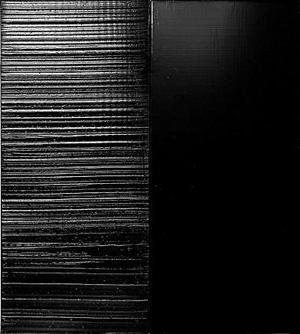
In 1979, then turning sixty, Pierre Soulages began the paintings he called Outrenoir. He could not have known that he would be working on them to this day. For his first exhibition in American in ten years, he has completed fourteen big paintings of unrelenting blackness since late 2012 alone, with a single date assigned to every one. The full title includes the dimensions as well, because every square centimeter of surface area matters. This is all-over painting with a vengeance. He may have never moved beyond black after all, or he may have moved across it into the light.
Soulages speaks of exploring the relationship between black and light—and how one transforms the other. In reproduction, his broad strokes of thick, reflective acrylic can approach white. They make the paintings an occasion for reflection as well. They do not, however, slowly collect the light, to appear in time as dark but translucent color. This is not the Rothko Chapel in white for Bosco Sodi, although Mark Rothko, too, drew closer to black late in life. One can be immersed in these works, but one cannot penetrate them.
The reflective surfaces alternate with flatter, more uniform rectangles only occasionally in oil, as two ways of throwing one back. The more visible strokes do not always run horizontally or vertically, in parallel, although most often they do. The thickest painting comes down to a single field of black, in which Soulages leaves his mark as if dragging himself through mud. It is unlikely that he executed it (or much else) with a brush. To insist that much more on the material presence of the work, he suspends some paintings apart from the walls, between wires from floor to ceiling, sometimes with the back exposed and sometimes back to back. They resemble steles, but as monuments to nothing but themselves.
Outrenoir can mean "beyond black" or "across black," but also "and then black," for the slippery grammar of a compound word is like that. Soulages may appreciate, too, the similarity between outre and outré, for he would not hesitate to go over the top. He has distanced himself from Tachisme, the French version of Abstract Expressionism, either because of the movement's willingness to slide over into figuration and overt expression—or simply because he dislikes categories. Still, tache does mean "stain" or "blemish," and he, too, is concerned for painting as process and as an affront to business as usual. Regardless, he is a survivor, with his first retrospective back in 1960. He once found a warm welcome in America, with support from James Johnson Sweeney, the legendary curator at MoMA and then director of the Guggenheim.
Soulages describes his discovery of Outrenoir as a breakthrough, but he was working in black all along, including paintings in oil from the 1950s and 1960s on the second of the exhibition's three floors. In some, black mixes with the color of furniture polish or coffee stains. In another, blue gains intensity from its surroundings. Yet others stick to black and white, like late Jackson Pollock, and their shapes recall Franz Kline, Robert Motherwell, or Clyfford Still. He did not so much adopt black after 1979 as move with it, covering the canvas entirely with the bluntness of Frank Stella in black oil and enamel. The thick stripes and rectilinear compositions also have a parallel in flags by Jasper Johns.
One can see him as a throwback or a contemporary. (It would be good to see a history of Outrenoir, like an extended diary, rather than a leap over forty years.) The gallery compares him to such long-departed friends as Sam Francis, but also to the conceptualism and reserve of Wade Guyton and Christopher Wool. One might think instead of a continuity from postwar abstraction to Minimalism to Postmodernism. Somehow, at the very height of color-field painting, many were moving to black. Yet the move started earlier than one often remembers, and it continues its winding course to this day.
From clarity to complexity
Henrik Eiben calls his show "Clarity," and it all comes down to a single element, a diagonal. And then things get complicated. Not that the work is anything but lean—a gain from looser, earlier structures. A sculpture amounts to two painted rods running side by side along the wall. A painting has a single stroke of color on a field of varnish. A drawing consists of little more than Popsicle sticks, while a sculpture in wood looks like Popsicle sticks blown up to poster size.
Even the largest and messiest composition has plenty of near parallels and plenty of room for air. The show opens with what look like swinging gates, although immobile, at angles to a single gallery wall. Each rectangle frames still more diagonals running every which way in the plane, like fussy grillwork for a suburban estate. Each in turn leans opposite to the one before, like successive stop-action photographs by Eadweard Muybridge. Still, the components leave mostly empty space, and the entirety leaves visitors plenty of room to pass. As always with the German artist, diagonals also rarely depart all that far from the horizontal or vertical—a reassuring reminder of the clarity of the grid.
Of course, reassurance goes only so far. That departure gets things going, as in the felt wave that carries one past sculpture and into the room. Each work has its own multiplicity, much as the gates have both diagonals within the frame and the diagonals of frames against the wall. That field of varnish is a slim diamond, the white wood frame a sculptural element on roughly the same scale as the stroke of color, and the lacquer shimmers. Look again at the parallel rods, and their offset creates other diagonals in the plane of the wall. The ends themselves are beveled, lifting the work into space.
 It has plenty of space. The show opens his gallery's impressive new location, running three floors and a full block deep on the Lower East Side, with windows at either end. The work itself embodies the much used term "drawing in space," going back at least to David Smith and Anthony Caro. For Eiben, though, drawing in space means bridging media. Line becomes the frame for painting on glass that could be sculpture. Colors run under an opaque layer, with the mute quality of abstraction for Jasper Johns—and then the two largest paintings turn out to be a diptych, multiplying drawing once more.
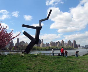
Eiben's wood, aluminum, and polished brass share the gentle imbalance of Joel Shapiro, the broken architecture of Cordy Ryman, and the chaos borne of simple directions for Sol LeWitt. Speaking of clarity, Shapiro is back as well, with his largest piece ever, even compared to his summer sculpture in the parks. A small front room reintroduces his range, starting with the slim, angled beams of an exceptionally clumsy male dancer, only now tumbling out from the wall. Another sculpture, this one firmly on its pedestal, shows his affinity for Mark di Suvero—who just happens to take over a window across the street. But then, just when you thought you knew Shapiro cold, he fills the back room's cathedral space with color, from wall to wall and floor to ceiling. One could mistake some of the ceiling beams for parts of the work.
Shapiro's stick figures humanized Minimalism without the biomorphic shapes of Eva Hesse. They also anticipated the revival of Post-Minimalism and the space between abstraction and representation in art today, a space visible in titles for Eiben like Blackbird, Yellowbird, and King Animal as well. It all hinges on hinges—or rather the carefully weighted imbalance of connected parts. This time, though, Shapiro connects his ten large wood beams and planes with nothing but wire, empty space, and the very imbalance. Yet they leave no doubt that they belong to a single work, like an exploded Piet Mondrian arrested in mid-flight. As one ducks past the wires, the imbalance becomes one's own, like a grander and more colorful trip past the gates.
End of story
You are in for a long story, but you may have heard enough of it before to guide you. It is about a series of works or perhaps a work in series. It is also about squares, red squares. They look all but identical at first, but not for long, and the changes keep coming. The differences manifest themselves in the opacity of paint, as flatness gives way to pigment and light. And then the story ends, with a renewed center of attention and the ultimate in "slow art"—until, that is, the artist moves on to the next.
Be careful, though: memory is tricky, just like first impressions. This particular story borrows liberally (at the very least) from Kazimir Malevich and Ad Reinhardt. When Betty Kaufman calls her show "A Story of Red," she could be talking about them, painting, or the color. She could be refusing to deliver on her promise and not telling stories at all. Painting, after all, shows rather than tells, right? Go ahead and enjoy the story regardless, because she and the color red have earned it.
One can see the show's centerpiece as single or plural, in space or in time. Take it as variations on a theme, with thirty-nine paintings that push at the borders of a square. Strictly speaking, they are squares—eighteen-inch wood panels painted white. Each contains something approaching a red rhombus, but with jagged edges here and there. One can see them as cutting away from a square or as the accumulations of multiple squares. One can see the tilted edges as angles in the plane or in the field of vision.
Depth also appears in the wood's variable thickness. Maybe Kaufman thus insists on art as object, or maybe she just will not play by the rules. A salon-style hanging further denies a linear narrative. The gray rectangle behind them, painted directly on the wall, allows the red to "pop" out from the picture plane and into space. To confuse things further, artful hangings of other works in the show encourage one to see them in sequence. Few of them are red.
One sequence pairs Reinhardt's two favorite colors, red and black, although Kaufman paints in acrylic and not his oil. Another has tidier white quadrilaterals on unpainted wood, to clarify her materials—or in homage to Malevich's white square. Still another sequence overlays translucent whites against a colored ground. The tilted planes seem to radiate outward from a common center, like starlight, while also suggesting architecture, like the fall of light in a cathedral. The gallery speaks of Kaufman's sensuality and her "luscious lipstick shades," but the last word may go to Modernism after all and the dimension of vision.
Color-field painting may seem the antithesis of Reinhardt, but Joan Mitchell had her own black paintings, and so do artists today. Like his, Mitchell's culminate in the mid-1960s, and they emerge from a tangle enlarging the boundaries of a square. Like his, too, their spareness hides a dedication to color. The burst often settles toward the top, as if Adolph Gottleib had misplaced half the signs in his "pictographs." In drawings, charcoal, oil, watercolor, and pastel tease out the tangle. Mitchell thought of nature, in which growth both turns inward on itself and extends beyond geometry, as in trees from those same years and after, but she is still telling the story of color and the square.

Pierre Soulages ran at Dominique Lévy with Galerie Perrotin through June 27, 2014, Henrik Eiben at Pablo's Birthday through March 16, Joel Shapiro at Paula Cooper through February 22, Betty Kaufman at Leslie Tonkonow through June 28, and Joan Mitchell at Lennon, Weinberg through June 28 and at Cheim & Read through August 29.


