Hard to Explain
John Haberin New York City
Harmony Hammond, Pat Adams, and Francis Hines
It may seem hard to believe after all these years, but abstract art was once hard to talk about. It was shocking. It was new, and it stayed new for a long time to come.
Was it abstracting away from nature or stepping away from nature, to make art what it could be, to make it new? Was it an image or an object, a process or a form? Was it an evasion of responsibility or a taking responsibility? Was it all about the artist or all about painting? Finding words seemed that much harder and more urgent after World War II,  when abstraction became a new norm, and critics of "pure painting" and "action painting" faced off. It took on greater urgency still when artists persisted, even as critics declared that painting is dead.
I often wish that it were still hard to take for granted, and one can always hope. Some painters still remember Post-Minimalism, when things got messy, or color-field painting before it, when things became luminous and clear. Harmony Hammond is still building up a surface and beating it down. Pat Adams, in turn, is still throwing in everything she has but worldly referents. It gets suspiciously familiar but still hard to pin down. Yet Francis Hines did his best to wrap things up.
Why might you set about wrapping something? It could be to preserve it, to present it as a gift, or to prepare to throw it away. Any and all those motives might apply to Hines, but with a bitter irony. His work ended up in a dumpster, when an "environmental and demolition" firm cleaned out the barn that he had used for a studio. He had lived well into his nineties, long past the days when he was prominent enough to have wrapped Washington Square Arch, for a performance and sculpture that no one could miss. Now he returns to New York, and his art proves not so easy to untangle.
Assessing the damage
Harmony Hammond calls her recent work "Accumulations." She could just as well have described it as worn away or beaten down. A bruised, thick rectangle in dark red, lying flat on a shelf, might have melted in place. Burlap, belts, and fasteners cross a bedraggled surface pierced with further holes. A few tangled strings hang off the topmost layer, as if unraveled, torn apart, and cast aside. The prevailing white might itself represent a wearing away—and the red of the string a warning of what gets left behind.
Even as her textures and materials accumulate, they seem badly damaged—unless, that is, they are the ones inflicting pain. I hesitate to mention associations with belts and straps. The gallery speaks of her art as "gendered brutality," which itself is confrontational. Is a woman allowed to be brutal, and can a woman nearing eighty still cast the first stone? Or is her art a record of her own endurance? You may draw back lest the brutality extend to you.
Hammond's imagery is itself bold and brutal. It reflects a late modern rigor and simplicity, when it is not rejecting that norm out of hand. Stripes form nested squares, akin to the Mitred Maze series by Frank Stella in the early 1970s. The thickness of her paint and fabric might be a pointed reply to his formalism. Their whiteness, without the shimmer of Agnes Martin, responds to his bright colors and earlier black. Where his stripes never touched, hers always do, giving them a greater physical presence.
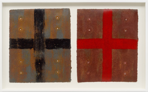
Another series has a still barer and more iconic image, a red or black cross. Its fabric layer lifts the image off the surface and into your face. Punched holes in the surrounding surface add a contrasting penetration into space. At times, the red or black has vanished, leaving only the accumulating void. In each case, she is demanding and refusing symmetry— and her most symmetric work refuses gendered expectations that much more. It quotes, unmistakably, the decorative arts.
Is this Minimalism, Post-Minimalism, or Neo-Minimalism? It never gets as bulky and biomorphic as others like Eva Hesse. The decorative paintings could pass for quilting or wallpaper, identifying the media with the wall. Still, it accords with a renewed interest in the body, especially a woman's body. It also accords with a renewed interest in women artists of her time. The gallery also represents Joan Semmel, whose realism makes the aging body explicit.
Who is doing or taking a beating? If a woman is traditionally a healer, Hammond could also be repairing things after the damage and building them again after the wearing down. The belted white paintings have a refined title, Chenile, after finer fabric. Other titles speak of a painting as bandaged or patched. The complexity of her images may feel arbitrary, but she makes a point of her lack of a signature image, pairing canvases or monotypes as diptychs. They identify her imagery and materials with making, unmaking, and remaking again in time.
Holding it together
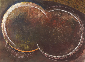
Pat Adams throws so much into a painting that you may wonder what could conceivably hold it together. Circles, ovals, arcs, lines, and planes—she could be taking an inventory of abstraction even now, well into her nineties. She fills them with color, shadow, or spatters, layer upon layer, ranging from highlights to black. She may use them to build a painted surface one spot at a time or allow them to cross that surface, like crossing the room.  You may recoil at all the muss and fuss, but her larger paintings give them room to play out. Still, they keep coming back to the detail and disruption.
You may wonder, too, what could hold together her materials. Adams works in oil, but along with mica, egg shell, enamel, sand, pastel, and wax crayon. The list itself, like that slightly redundant final term, refuses to separate pigment from substance. She got a start when it was still fashionable to speak of art as object, in the late modern belief that the image was not everything and illusion was nothing. Postmodernism all but gave up on painting but said much the same thing. Either way, where others had shaped canvas, Adams had her resistant surface.
That shift may sound unduly subtle, but it puts the emphasis on painting itself. It also brings her closer to material science than to old-school formalism. She, too, had to worry what holds things together, and she found an answer in the binder. She adopted isobutyl methacrylate, a colorless liquid used in the manufacture of resins. You are likely to find it on Web sites more concerned with environmental chemistry than the arts. Yet it does hold things together, along with her curves.
Her compositions get their impetus from curves, sweeping across the surface. They keep moving, too, with looser curves and spatters within. That is why her large work has the greatest impact. They also bring her back to the surface by identifying a painting with the wall. Her textures recall the plaster and dirt of a painted wall as well. One might easily remember her work as a single warm, speckled brown, although it has plenty of red.
When it works, which is often enough, it derives its energy from the play among the explosion of red, the darkness, and the static, textured substance. A bar of bright yellow zips right across, too, only this "zip" (as Barnett Newman would call it) lies at angle off the vertical. Just eight works are enough to take her from 1978 to 2008, and nothing much changes along the way, for all her visual and material variety. She has spent that time in New England, studying and teaching. The gallery places her with Kenneth Noland and Larry Poons as "Green Mountain boys." Sure enough, Noland has his own curved bands, the targets, and Poons no end of muss and fuss.
She accords with the revival of painting and the recovery of older artists—especially women in abstraction like Regina Bogat and Lynn Drexler. She also accords with a critical taste that prefers small gestures and ambiguous images to bright colors and hard-edged geometry. The gallery quotes a strong advocate for that taste, John Yau, as it has in past shows. Others may see big paintings with too much or too little going on. What happened to the iconic motifs of postwar abstraction? With Adams, they matter less than substance, scale, and action.
Under wraps
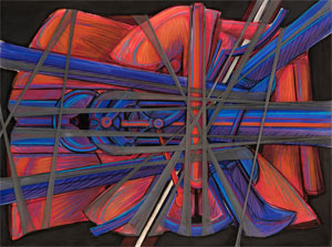
Francis Hines snagged that Connecticut studio in the 1970s, but he was a New Yorker in his own way to the bitter end. He began as a commercial artist after studying art in college and service in World War II—becoming chief artist for a Brooklyn department store. Andy Warhol started much the same way, although without a condo in the Village and a second studio on the Bowery. Something, though, was nagging at Hines, like abandoned cars on the streets. He assembled five of them into a pyramid, wrapped it, and translated it into pastels wrapped in fabric as well.  They became his Mutagenesis and Hoboken Autobody series of the mid-1980s.
It also rescued his legacy from the dumpster. A worker spotted the auto parts and called in someone who knew cars. Fortunately, the newcomer knew something about art as well. He saw pastels on paper with the scale of paintings and with the physical presence of oil on canvas. Colors run to deep red, blue, and pure white. Taut fabric adds thickness, elasticity, and tension.
That tension is crucial. Hines may have named the work for Hoboken to insist on the gritty side of a city, for all his Manhattan assets. It also links wrapping to a discomforting physical intrusion. It cannot help suggesting kinky sex and artists like Senga Nengudi who work with stockings, stones, and a woman's body. It may be just a coincidence that a Web search links to instructions for wrapping a body (firmly) for taxidermy. It is no coincidence that he called his late series Cages and Organisms.
He was, then, prescient and mainstream. He wrapped the arch in 1980, twenty-one years before Christo wrapped the Arc de Triomphe in Paris. He stretched his gauze at waist and eye level across an aisle of the Port Authority bus terminal, where it seems less a wrap than a barrier. He had his illegal incursions, too, before Jean-Michel Basquiat, Banksy, and graffiti made "Defacement" fashionable. Still, Hines had a fragile success. Most, myself included, had not heard of him until the dumpster made him easy copy for The New York Times.
It might have been his late start apart from commercial art. The gallery, which leans to recoveries from those days includes two paintings from the 1960s, and both are intriguing. People take to the beach and to an enigmatic gathering that the title identifies as a funeral. Technique relies on cuts into paint, for slim lines of yellow amid the red. Still, they look small and conventional. He needed the city to come to life—that and a fuller encounter with gestural abstraction and Post-Minimalism. Maybe he needed to acquire the arrogance of wrapping the body and the city as well.
Then, too, it might have been his reserve that kept him under wraps. His art may belong to New York, but he had no trouble at all moving away for good. He gets along well with Dana James, an artist in her thirties in the gallery's main space, with her own play between the layered and the visual. She builds a work from more than one canvas, some of them curved at top or bottom, with encaustic and collage as well. Her pale blues look less bland in person. Still, Hines belongs to the 1980s, when painting was losing its credibility but challenges to painting from within painting had not—and it might not hurt to see more in the way of challenges today.

Harmony Hammond ran at Alexander Gray through June 24, 2023, Pat Adams at Alexandre through April 22, Francis Hines at Hollis Taggart through November 18, and Dana James at Taggart through November 11.


