Color Takes Time
John Haberin New York City
James Turrell and Ad Reinhardt
Michael West, Albert Kotin, and Lynne Drexler
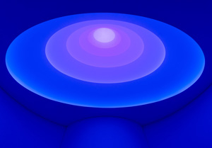
James Turrell does not play around. For him, modern art is not a puzzle, with or without instructions. Contemplation should begin immediately, like the expansive color of his light fixtures, but it deepens with time all the same.
True to his word, he still has discoveries to make, if not always in his work. So what could be more promising than to set him loose in Chelsea to curate a show of Ad Reinhardt, who died in 1967? It appears two floors above his own work, associated more with sculpture and Minimalism than Abstract Expressionism. Somehow, though, he cannot resist making the older artist over in his own image.  Meanwhile a gallery displays two others from the glory years of America painting, Michael West and Albert Kotin, soon after rescuing another from the trash, while two more galleries pick up Lynne Drexler and her color bursts soon after. It shows the complexity of recovering neglected artists.
I have seen my share of trashy art, but how much of it ends up in the garbage? Some lands instead in the finest galleries, to no end of attention. Yet a dumpster served Francis Hines as the entirety of his estate upon his death in 2016, at age ninety-six. Now he has a show in Connecticut, as I describe in a separate review, and plenty of coverage in the press, and it looks anything but trashy to me. I shall find out for sure in Chelsea in 2023, when it is more to me than just online, and can think harder about the implications. For now, that Chelsea home accommodates West and Kotin, and they look all the better after a quick tour of abstract art today.
Never let it go
A black painting by Ad Reinhardt takes time. Is it off-putting, like Reinhardt himself in many a quote? Is it boring? For the patient or the expectant, there is that special moment when a cross reveals itself, along with shades of blackness. What looked like an exercise in logic becomes an exercise in color and every bit a thrill. Nor is it the modest thrill of the plot twist in a murder mystery, when one can finally declare an ending. Contemplating art is only beginning, and its mystery will not so easily go away.
James Turrell is not much of a thrill seeker, but a seeker all the same. What, he asks, changes as Modernism becomes Minimalism—and what is the role of geometry, with and without hard edges, or of color in art? What are the roles of material substance and vision? He may not have his best work at age seventy-eight, but hardware takes on a greater role and a field of light a greater variety than I knew. Color for Reinhardt, though, becomes just one more expanse on a par with others, much like Turrell's. It is no longer one of a kind.
Here a black painting does not stand alone or as the culmination of work in red and blue, but is just one shade among many. It is revealing all the same. It is also a model, it turns out, for painters today, even those who do not count it as an influence. Up in East Harlem, Isaac Aden seeks what a show calls "The Numinous Sublime." One could mistake his darker paintings for monochrome, akin to Milton Resnick and often on the scale of Abstract Expressionism. Some are triptychs, with the center panel raised above the others, making their geometry and aspirations to the iconic hard to miss.
Soon enough, Aden's free brushwork kicks in, all the sooner in lighter colors. Sunlight might have fallen on a dark canvas, leaving its mark. The association is all the more obvious in a much brighter painting. It evolves from darkness at top through the red of dawn to bright yellow along the bottom edge. It does, that is, unless the eye moves instead from bottom to top—or to the whole. With four shows, the gallery becomes a lesson in color in itself.
Jeremy Gilbert-Rolfe juxtaposes markers of abstraction from isolated brushstrokes to the grid, while color wheels by John Mendelsohn may look as much like exercises as anything. Yet their slim radials are never predetermined and inescapably handmade. Immediate neighbors can have sharply distinct colors. Heather Jones builds on tidy triangles and bars, in color and in black and white. They may come together as nested squares or collide and come apart as in a car crash. They cannot quite line up either way.
Like many today, Jones treats fabric as canvas. The colors are acrylics, but also cotton swatches sewn together. If that recalls quilting and American tradition, she calls the show "To Hold Tender This Land." At the dealer's new Chelsea branch, Carl E. Hazlewood picks up on color-field painting in a different way, with abstraction's place in time. He got paintings under control in 1997, by cutting strips of acrylic polymer away—and now assembles the discards into slim horizontal triptychs, whose outlines bring a semblance of discipline to the cloudy brushwork. Some artists, like Reinhardt, can never let go.
Not so trashy art
A gallery borrows a floor just for Michael West and Albert Kotin—further testimony, if any were needed, to how tricky it is to account for the past. Rediscoveries often focus, rightly, on diversity, like a look back at early American Modernism from the Whitney Museum right now. Corrine West went professionally by the name Michael, and she played against stereotypes of men or women in abstraction. The show's title speaks of her boldness, and one might easily mistake her thick black crossing strokes for the work of Franz Kline. If she also drew faces with a touching vulnerability and uncanny realism, that generation grew up drawing. Think of Arshile Gorky and his memories of his mother.
Like Gorky, Kotin was male and an immigrant, in his case from Belarus. He was also part of the right crowd. Born in 1907, he took his time to get there. He showed with the fabled Ninth Street show in 1951, when a critic as important as Harold Rosenberg singled him out. He hung out with Kline, Willem de Kooning, and the Eighth Street Club, and he had his studio in the midst of them on a strip of Tenth Street. (So many street names.)
He and West both studied with Hans Hofmann, like Lee Krasner and so many others in that new wave of American art, and they go well together. West has space off the elevator to introduce them. Often as not, artists like Mark Rothko and Jackson Pollock had to work through realism and Surrealism toward abstraction. West's works on paper play against that stereotype, too. Her realism lines the corridor, facing a modest room for abstraction, and the genres appear as equals. Could the movement's real secret lie that one fateful step beyond realism—in the balance between the delicacy of line and the boldness of paint?
Kotin works in just that space. The main room has enough examples to suggest his development. Hints of realism in flatter, more self-contained swatches of paint take him through the late 1940s. A decade later, lighter colors, all-over compositions, and a more impressionist touch show the influence of Joan Mitchell and the turn toward color-field painting. Darkening again in work from the 1960s makes that turn stick. In between, of course, comes Abstract Expressionist New York in all its rigor and excess.
The arrangement is anything but chronological, allowing one to dart in and out of the paradoxes. An excess of bright yellow bursts out from smaller clusters of tart red, green, and white. A thick but irregular weave of white on black recalls Pollock drips but earns its title, Spanish Dancers. It may be just another coincidence, but Irene Monat Stern, a contemporary artist in the main gallery, completes Kotin's journey to color fields with stains that echo Morris Louis. Her husband, Jan Peter Stern, adds sculpture. They can seem like throwbacks after the originals upstairs, but nothing belongs in the trash.
Bursting in air
When Lynne Drexler calls a work Burst Blue, you can feel that burst of blue in your gut. You may not have seen the title, but you know it all the same. In the course of a decade, fields of paint gather and acquire highlights that push them against one another and out of the picture plane, as pure and impure color.  A two-gallery survey tracks her progress, starting in 1959. She built her work around color from the very start, without drawing or drips. It just took her a few years to make it pop.
Does the illusion of masses of sheer color make her out of touch with formalism—or does it bring her closer to the demand for art as object in late modern art, much like the "floating lattices" of Thornton Willis? Just to ask is to put in question an old putdown, second-generation Abstract Expressionism. She knew both sides of the question at that. She, too, studied with Hofmann, like Krasner and Pollock before her, as well as with Robert Motherwell, although she must have found his work way too spare. She never does boil painting down to a visual signature, and it has cost her. Her immersion in color for its own sake only contributes to her neglect, but it makes her interesting as well.
It also roots her in her time. This is her take on color-field painting, if a messy one. As with Joan Mitchell, Helen Frankenthaler, and Mary Dill Henry, her largest work is also the flattest and closest to nature. Color here can resemble the water's surface with the opacity of vegetation, like an update of Claude Monet Waterlilies. It was time, too, for the turn to Minimalism, and Drexler sticks increasingly to red, yellow, and blue. Call it Minimalism or not, but Frank Stella made the picture plane land in one's face as well.
You may have heard of her work as Pointillism, because of its repeated daubs of paint. They bear, though, the full mark of a brush, not the fine point of Georges Seurat. They look more like tiling, with all the materiality that implies—or computer chips before their invention. One shade of blue might develop within and dapple another. Some work also has parallel longer strokes, as she searches for the proper role of color. She was already out of her twenties when the show begins, so the search must have taken on urgency.
"The First Decade" really amounts to two exhibitions of half a decade each. True to form, the Upper East Side gallery has her still close to the blue chips of Abstract Expressionism. Chelsea then picks up the story, at a gallery dedicated to the second generation, especially women. That mission has earned it its third and largest space yet. Drexler calls another painting Vitality, and the gallery sees her as vital. (The catalog has a contribution from Lois Dodd, suddenly all over the place as well—from her own recent show to a portrait by Alex Katz at the Guggenheim.)
Only in the second half of the story does color burst. Paintings adapt a uniform size, sea green vanishes, the background approaches black, and the tiles become lighter highlights running the wavy length of a color field. Color at last becomes mass, and colors collide. As another title has it, this is Drexler's Color Carnival. That may sound awfully upbeat, but enjoy the carnival while it lasts. Oh, and look forward to the next decade.

James Turrell and Ad Reinhardt ran at Pace through March 19, 2022, and Lynne Drexler at Mnuchin and Berry Campbell through December 17. Isaac Aden ran at David Richard through March 3, John Mendelsohn and Heather Jones through March 18, Carl E. Hazlewood through March 25, and Jeremy Gilbert-Rolfe through June 19. Michael West and Albert Kotin ran at Hollis Taggart through June 4, Irene Monat and Jan Peter Stern through May 21. Related reviews look separately at James Turrell, Ad Reinhardt, and Reinhardt's black paintings.


