Charting Abstraction
John Haberin New York City
John Mendelsohn, Meg Lipke, and Mary Dill Henry
If you reproduce a color chart, but reverse the colors in printing, is it still a color chart? If you paint a color chart, faithfully, is it a color chart, a copy, or a painting?
Artists have been playing mind games like these since they first left the print of their hand or tested out a color sample in a cave painting, but none as tellingly as Gerhardt Richter. He made his first color-chart paintings in 1966, and they are not getting any younger—or any less a model for others. Can there still be room for John Mendelsohn and his Dark Color Wheel Paintings? Can an artist still stand out in a crowded market with the visual alone? Only if you bear in mind the paint, the wheels, the color, and the darkness. Only, too, if you put down your smartphone, with Meg Lipke and, like Mary Dill Henry before her, get back to the garden. 
Wheels of fortune
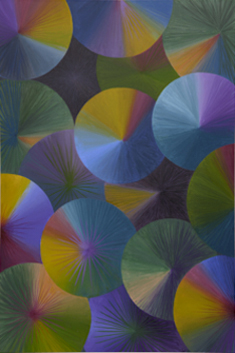
John Mendelsohn takes them all seriously, on their own terms, from the paint and the wheels through the color and the darkness, but they work together. The wheels might be spinning, their radial fields of color as distinct as the blades of a fan. They might be emerging from the ambient darkness to reflect the color and light. He paints in bright colors, metallic highlights, and further overlays of darker shades. Black curls mark the center of each wheel, like the marks of a pen, but he works in acrylic with, I can only presume, a fine brush. He hides neither the care he takes or nor his traces.
The twelve paintings also work together, as variations on a theme. They seem that much more in motion from the shifting colors floating in darkness. They also seem that much more static and systematic, like actual color wheels—and that brings things back to 1966. Are these anything new? Are they Minimalism, conceptual art, or a basis for painting? They are not really systematic, but then neither was Richter.
Gerhard Richter had a way with illusion, even as he undermined its very possibility. Richter's abstract paintings leave nothing to chance, but on a scale that nothing could reduce to a formula. Smeared ink could serve as the basis for inkjet prints and poured paint for monochrome brushwork. His blurred photorealism, based on photographs of the Baader-Meinhof gang, dead or alive, seemed concerned less for the death of painting than the terror of living on. Portraits seemed to slow time in pursuit of a vulnerable beauty, even as a divorce was tearing his family apart. So much for the originality of the avant-garde—or, for that matter, a postmodern fixation on the copy.
When it comes down to it, all artists work within an idiom and strive to leave or to deny their traces. Joanne Freeman, to name just one, lends hard edges to irregular shapes and the marks of her brush, like a nude or swimming pool in cutouts for Henri Matisse. Set side by side, overlapping, or stacked, her shapes approach rectangles and ovals, like those of Robert Motherwell in black. Yet that only brings out her soft, clear colors and her way with white. It may provide a backdrop, define the picture lane, outline a border, or redouble one. Discipline here demands doubling.
Not that Richter was entirely original, assuming the question still makes sense. Jasper Johns set the bar for luxuriant paintings that could serve as their subjects. One could target his targets, way too close, or learn geography from his maps, their borders shot to hell. The dryness of design formulas and the Bauhaus seems a thing of the past. Then, too, the Met has made the case for Cubism in the trompe l'oeil tradition—a tradition that Georges Braque, Juan Gris, and Pablo Picasso left far behind. And that returns the question to what one means by formulaic painting or indeed a formula.
That question grows more urgent each day, as so many paintings look great without quite standing out. Is the radial black and white of Rico Gaston the backdrop to mind-blowing overlays of color or satisfied assertion of the African American portrait at their center? Are they better or worse than the fluid colors of Monique van Genderen just next door, or the modernist architecture and distorted color of Daniel Rich up the block? I ask that while spinning the wheel of fortune almost every time I visit their gallery, and so many more—including Mendelsohn's and its four separate spaces. Am I not giving art the time it takes, or they not demanding time? Mendelsohn in series does take time, and for now that will have to do.
Smartphones and smart paintings
It takes courage to make art in the age of smartphones or maybe folly—or to keep going as long as Thornton Willis in geometric abstraction. Who has the attention span now to look at a painting, much less to complete one? Meg Lipke cannot so much as round one off in the shape of her iPhone. She never gets past one corner of the custom stretcher. Her image never quite coheres either—or breaks fully away to abstraction. That does, though, make it one smart painting.
 Lipke knows ephemera, but the demands of art as well. She has collaborated with dance in performance, although I must take the gallery's word for it. Yet her last show made a point of the art object, with stuffed canvas as the ground for paint. She took pleasure in that point, too. Where Senga Nengudi makes performance art and sculpture from sheer fabric, like stockings weighed down by a woman's body as by a stone, one might cling to Lipke's for comfort in a cruel art world. She also arranged her painted pillows, parallel and crossing, into larger structures, like rafts just in time for a rescue. Their scale and geometry affirmed, too, their sculptural presence in the gallery.
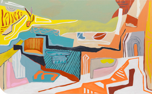
Were they a little too comforting, and did they leave enough surface area for painting? Her new work responds with acrylic on canvas, up to more than seven feet tall and nine feet across. Only in retrospect can one see a continuity in her designs. Lipke still relies on wiggly black lines, from brief marks to several feet in length. Bright colors and half familiar shapes can then steal the show. A hand print has eyes, combining two marks of the artist, with eyeglasses at their side. Other images suggest anything from sea creatures and butterflies to plants, clouds, and architecture.
She knows, too, the need for attention—and not just from those who cannot look up from their phone. These are big canvases with big, flat colors, like Henri Matisse with a smartphone. One painting has a red check mark at its center, as a final seal of approval. It is her personal seal at that, in work that has nothing in common with computer art for Refik Anadol at MoMA, who claims to have ceded control to artificial intelligence and crypto. The gallery sees her rounded corners as a further link to past work, in its insistence on painting's mass, but a subtle one. And subtle may be the last word that will occur to anyone facing her buoyant art.
I, too, feel the demands on my attention, as I pass from gallery to gallery, wondering if I can do justice to the art. And nothing is harder to judge than the revival of painting, in that space between representation and abstraction today. Her gallery, in turn, runs to big painting on the edge of installation, as with Edie Fake. It avoids the cheap crowd pleasing of at least one popular downtown gallery I could name, but the risk remains. Are Lipke's wiggly lines a little too close to cartoons? She stands out all the same, thanks to her rounded corners, ambiguous images, wiggle room, and the curious comforts of the everyday.
One title speaks of cave paintings by (some argue) women, another of Dykes. Still, one need not look to gendered identity and deep history for weight. It is enough to take in the painted image—and to watch it never quite cohere. Its scale shifts often, as the eye crosses whole, and hints of depth collide head on with the flatness. Landscapes, seascapes, and interiors emerge not as accomplished form but as sites for discovery. Their inhabitants are uncertain, but they might be you.
Back to the garden
If you did not know of Mary Dill Henry by 1982, you were not going to find out anytime soon. Like many a West Coast artist, she had only modest exposure in New York. And then, just short of her seventies, she moved to an island off the coast of Washington, itself heavily wooded. She might have been seeking as many barriers as she could between herself and the art world, like Emily Nelligan in Maine. Nothing less, she might have explained, would have left her to herself and her imagination. Nothing less, too, would have demanded that she look and that she see. Yet her acrylic reached out well beyond the forest and the sea.
If anything, her work has less to do than ever with nature or the imagination. She makes no effort to keep up with art, but she accords with the recovery of women in postwar abstraction, at a gallery that specializes in just that. That tends to mean the dreaded "second-generation" Abstract Expressionism, like that of Lynn Drexler in the same space just before.  Henry, though, comes closer to the first generation. She was just five years younger than Lee Krasner, more than ten years older than Helen Frankenthaler and Joan Mitchell, and twenty years older than Merrill Wagner. Yet she stuck to hard-edged geometric abstraction, just when it was going out of style. Her most recurring elements are stripes.
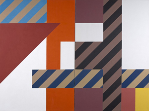
Not that she was in the least minimal, much less a Minimalist. Her stripes fill fields with a geometry of their own, making it hard to number the shapes or to separate figure from ground. They seem perpetually in motion, changing color or direction at a boundary. Some are black and white, for further patterns and their clashing. They might have gained or lost full color in the process of setting them down. They are only natural for works on paper, and the show includes its share, but they really take off on the scale of a painting.
That makes her newly trendy in a second way, quite apart from as a woman in abstraction, with the revival of "pattern and decoration." Not that she had much interest in the decorative arts—as opposed to what a contemporary might have called "pure painting." Still, she was reaching out in another way as well. Her departure from observation and her imagination alike took her to the gardens of Europe and the Middle East. Her memories ran far from the Pacific coast, to traditions as diverse as a well-manicured English garden, a Persian lushness, Zen, and Claude Monet at Giverny. They showed her a thoroughly human version of nature. They challenged her to incorporate their conflicting impulses in art.
For all that, they appear less as places or styles than fixed motifs. They also have a notable absence of flora. The bent ovals of mosaic tiling serve as a counterpart to the fields and stripes, much as for Brice Marden. Again she imparts a sense of motion, and again she confuses figure and ground, only here the ground beneath her feet. If all that muss and fuss sounds like a burden, she still has to struggle for recognition more than a decade after her death. She was news to me.
The very clashes break the paintings wide open, as in the very largest work at the show's center. A mural takes its title from the Château de Hautefort in the Dordogne, not far from the historic cave paintings. It starts with a stepwise pattern in white, reflected across a central vertical, enclosing parallel black and white at left and blocks of color at right. One sees the blocks through slim black verticals, as if looking through architecture, but the blocks themselves bring the imagined view closer than anything to the foreground. If that leaves the viewer nowhere to stand, there was always the studio or gallery floor. Paint was Henry's cave and her castle, on an island in the woods.

John Mendelsohn ran at David Richard through January 6, 2023, Joanne Freeman at Kathryn Markel through February 11, Meg Lipke at Broadway through January 14, and Mary Dill Henry at at Berry Campbell through February 4. Rico Gaston, Monique van Genderen, and Daniel Rich ran at Miles McEnery through January 28.


