Women Remake Abstraction
John Haberin New York City
Perseverance, Zipora Fried, and Jane Swavely
I shall never forget the great age of postwar abstraction—and a pressing need for diversity. I sought out abstract painting when I began this Web site nearly thirty years ago, from the Upper East Side to Staten Island. And I keep returning to galleries that recover women artists from a time when they thrived, suffered neglect, or both.
Could, though, those imperatives collide head on? At least one Chelsea gallery thinks otherwise (and apologies that my obsessions so often bring me there). It opens the new year with women who endured, as "Perseverance." Could it be right? The show cannot avoid colliding with itself, 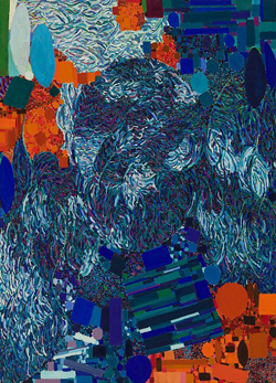 but you can feel the impact in your gut. It is also just part of the give and take within abstraction today.
You may have lingered a long time with Georges Seurat, but never over a single dot. Yet he did. How else to create the luminous color of A Sunday Afternoon on the Island of La Grande Jatte), without a mathematical formula in his head or digital assistant by his side? He brought the same precision and stillness to works on paper, trusting again to his hand and eye. Zipora Fried asks for your trust, too, as she extends his Pointillism to verticals, set side by side in the horizontal bands of her abstract art. One can imagine her counting off the thousands—but not Jane Swavely, who zips right through abstract art in an epic encounter.
Two imperatives
Does "Perseverance" bring what you could never have seen when the work was made—or just another day in the galleries? You know the worst-case scenario all too well. A world war brought artists to America and unleashed the pent-up energy of New York City. (Not all that long before Mark Rothko created his dark or luminous abstraction, he painted the subways.) Yet it brought, the story continues, a stifling uniformity. Postmodernism and critical theory spoke often of hegemony, a white male hegemony.
Stories come all too easily. What if there were no typical days in the galleries? Most were showing other things entirely, like portraiture and prewar art. Others were moving on to challenge abstract art—in the name, at times, of its hottest stars and guiding lights. When it comes down to it, the narrative reads today's scene into lonelier days. Who back then could have imagined countless art fairs, endless money, and the dull uniformity that they, too, so often demand?
The dealers behind "Perseverance" do their best to keep up while looking back. Both are women, but then so were Betty Parsons and Peggy Guggenheim, who encouraged Jackson Pollock to break, literally, through old nostrums and new walls. They include the occasional younger artist, like Susan Vecsey, whose colors of sky and sea bring out the vertical weave of linen. They cannot make space for more self-reflective styles bubbling up when, wise men insisted, painting was dead. But how could they, without spoiling a show of women under the influence? I had to go to Staten Island in the 1990s for the sequel, to Snug Harbor, before a still more eclectic view of abstraction took over in Brooklyn, on the Lower East Side, and now in Tribeca.
The collision of ideals remains. Do these artists bring a near uniformity of gestures or something else again? Were they neglected because they accepted the hegemony, at the cost of originality, or because they refused? Postwar art itself was about the refusal of uniformity, and that brought contradictions, too. It called for not just gestures but signatures, like drips and floating rectangles. Is that because signatures help art stand out—or because they make it easier to sell?
The most memorable painting in "Perseverance" gets along just fine without a unique motif. Gesture for Perle Fine and Sonia Gechtoff brings a depth of color on a grand scale, and Judith Godwin calls her explosive gestures Wham. Not that a more obvious focus is altogether absent. Vivian Springford surrounds fiery pinks and yellow with a loose dark circle, like a nova, while more bright stains spread outward. Alice Baber piles on loose circles of color beneath her white ground, like a lonely crowd. There is more to art than making history.
The show has familiar names here and there, like Lynne Drexler and Helen Frankenthaler, neither with major work. Others seem largely indifferent to standing apart. Mary Abbott and Ethel Schwabacher set their forms in depth in wide-open fields of color that recall Arshile Gorky. Dorothy Dehner gives the steel of David Smith the dignity of true sentinels, while Claire Falkenstein treats his sheet metal, suspended within a cube, almost like tissue paper. If this is derivative, so be it. Connections were what gave the New York School its life.
Extending the dots
Zipora Fried does not object to calling what she does painting, although she works not in oil, but in colored pencil on board. She is, after all, in a long tradition of translating precision into luminosity, from Jan van Eyck through Claude Monet, Georges Seurat and Sunday on the park with Georges, and beyond. Up close, you can hardly escape a mark's physical presence. Standing back, you can still see colors mix within a single stroke, while relishing the glow. Bands may blend into a single field of changing color, like Monet's late waterlilies without a dot in sight. You can see the work again when you get home, online, where one can easily mistake it for color-field painting, with poured paint on stained canvas.
Fried is not quite in their league, but then who is? Her compositions are as intuitive as her marks, and ceramics in black and white are more irregular still. When it comes down to it, the Israeli-born artist is still finding her way. I first caught her ten years ago on the Lower East Side, when she built color from triangular tiling, and again two years later with freestanding paintings descending to the floor, stained on both sides. Her first bands of color had the distinct fields of geometric abstraction, with verticals as thick as matchsticks. Now they gleam and flow.
Time is on her side within a work as well. Once again, Seurat's dots have become verticals, each one taking time. Do not even think of counting. The bands encourage one to experience her work in time, from left to right, and many change color midway. One might contrast them with Seurat's stillness, but they are still about color coming to be. They are large works at that in a large room, inviting one to step close and allowing one to step back.
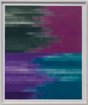 They also suggest landscape, with their most memorable color a deep blue. Others introduce a forest green, like the "dark places" of Tariku Shiferaw. As one title has it, I Know My Way Through These Woods, and it is also a boast. "Whose woods these are, I think I know," Robert Frost wrote, but forget the uncertainty of "I think." I thought, too, of Dante "on the middle of life's journey" and on the way to hell, "within a dark wood where the straight way was lost." What was lost may be found.
Fried shares the gallery with text painting by Kay Rosen, with its own certainty. For Glenn Ligon, an African American, text is curt and demanding, because so is America. For John Baldessari at Cal Arts, it is long on truisms and on the verge of making sense, because so is Postmodernism in LA. For Rosen, it denies the human hand while exploiting paint to send carefully mixed messages, and I leave a fuller account to a past review of her Chicago Minimalism. Still, anyone who partly blacks out a warning against censorship and writes HAT OMEN ANT has tricks up her sleeve. Women, it appears, want more than the letter W and the comforts of abstract art.
Landscape can take Fried only so far. The lowest color field might be a fiery red or yellow, as if unable to burn into the sky. Again, the point is the emergence of color in abstract art. How do ceramics fit the picture? Even now, I am not sure, but long black drips in their white glazing have a parallel in her handmade verticals, while here, too, shapes hint at representation rooted in abstraction—from urns and architecture to missile heads and weary bodies. In a show subtitled "Jubilation and Melancholia," they may serve as a chastening reminder of the melancholy.
Holding in the light
When Jane Swavely calls a painting Silver OID, silvery it is. It does not need metallic paint or glitter, just oil on canvas to shine. It does not need shifting reflections as one's eye crosses its surface or one's body walks beside. It attains that sense of visual and material substance with paint alone, the brush carrying pools of white as it will, covering and mixing with gray. It looks back to a time when painting pretty much meant painting in oil, for its ability to lend depth to a flat surface by holding in the light.
Not that everyone back in the day needed oil. Enamel and industrial paint were good enough for Jackson Pollock now and then, for their shine and low cost, but then he also threw in cigarette butts and coins. Still, Swavely looks back, in her scale and commitment to abstract art as well. Paintings can run up to ninety inches high, and the sixth in the series is ninety inches square. She likes how large paintings are that much more visual and material.
That version looks to a different postwar artist, too. A broad stripe descends the full height of the painting, much like "zips" for Barnett Newman. Swavely is thoroughly contemporary, and her paintings are and new, 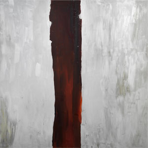 but then the Jewish Museum has argued for Newman's relevance to art today. Her zip, like his, cannot so easily stick to the edge or center of the canvas. Here its right edge falls just to the right of center. Still, it has fluid edges, much as Newman sometimes allowed his brush to show in a zip while keeping the background color seemingly untouched.
Hold on, though, for she is not just reworking the past. Blacks lend depth to that deep red vertical, much as whites lend silver to gray. The stripe is also more than a foot wide, like brushstrokes for David Reed, and another painting devotes roughly its left half to much the same rust and blood red. One could almost see the halves in collision, were the boundary not so loose and permeable. One could almost see the gray as background, were the brushwork on both halves or within the larger silver field and the stripe not so much the same. Other paintings defy the very thought of a zip, as one color climbs the right edge and crosses over the top.
They may look as if they date to the 1950s, but Swavely ls not history. Born in 1959, she has long exhibited with A.I.R., the women's collective in Dumbo. Just starting out, she assisted Brice Marden and Lois Lane at that. One can see Marden's equation of monochrome color fields with drawing in her abstract painting—and Lane's New Image painting, like that of Jennifer Bartlett and Susan Rothenberg, in her refusal of purity. The material nature of paint here is just that, a step into this world, not a higher calling. She might cringe at Newman's "The Sublime Is Now."
She fits with the present interest in overlooked women in abstraction, although she has exhibited regularly since the 1980s. She may still seem to fall between generations or run across them. Yet her work is a powerful alternative to the "everything goes" version of the revival of painting or, for that matter, to the zip. Past shows have presented a still greater depth, using dark, resonant colors with elusive outlines. There, too, she insists on that visual and material substance. It carries her from deep red against silver to color climbing the wall.

"Perseverance" ran at Berry Campbell through February 3, 2024, Zipora Fried at Sikkema Jenkins also through February 3, and Jane Swavely at Magenta Plains through February 24.
