Shades of Black
John Haberin New York City
Black, John Divola, and Andrea Longacre-White
León Ferrari and Kerstin Persson
Black on black and black and white. They may both sound so cold, clinical, and exact.
So when did they become sloppy or even fussy? When did they become an excuse for throwing in practically anything? When did subjectivity become the new black? John Divola and Andrea Longacre-White have one stumbling across a slippery floor in search of shattered minds, while León Ferrari and Kerstin Persson use photogravure and pencil to pierce the blackness. They all show how darkness can stand for palpable sensation, but is abstraction after Modernism proving a little too successful? A workmanlike set of theme and variations comes in a show called simply "Black." 
Back in black
"Black" sounds austere enough. Maria Wallenstal-Schoenberg even calls a work As Black as It Gets—but do not believe it. It consists of two blots on gray. Other works seem like a compendium of strategies, all notably arbitrary. They neither glow with light from within nor push out the light in the interest of surface and shape. This is not a formalist or conceptualist dream of painting that makes itself.
The dilemma of recovering painting's urgency persists, even when painting is again everywhere. The whole idea of thirty-seven artists with just one work apiece, all easel scale, sounds like business as usual. And one could easily have included a couple of dozen more. A standout amid contemporary painting at MoMA, Rashid Johnson for one works as a black artist in black, with traces in thick layers of soap and wax. Nothing here is half as deep, physically or emotionally. Yet one can still appreciate a newfound diversity in black.
Some, as ever, use black for its imagery and connotations, like Caroline Bergvall. For "Drift," she paints a wall black, interrupted by seemingly random circles of white. More strikingly, she suspends four square sheets of white from the gallery's floor and ceiling, each with a square at its center in varying shades of gray. Of course, the wall is the night sky, and the grays only partly hide the stars. This is nautical imagery, like the mist in any number of nineteenth-century paintings, with the squares suspended by ropes. Audio describes a treacherous voyage of hope from Africa to Europe in which sixty died, but you get the picture, and it speaks most eloquently in its silences.
By now, though, black squares are far more likely to mean abstraction. Not that black represents the still-greater energy and diversity of abstract painting, because it does not have to. Monochrome is neither ubiquitous nor dogma, but it can be productive—or even implicit. In paintings from the late 1970s, at a gallery that specializes in rediscoveries, Ann Purcell could well be bringing Clyfford Still to Taos, by adapting the black projections that he discovered in New York and the Great Plains to color. Her bright washes also recall Helen Frankenthaler, but for a time after the sobriety of Minimalism. It may take a moment to remember how artists then struggled to justify painting at all.
Some now use black plainly to shape a painting, as back in "Black" with a folded shield from Edgar Diehl, wedge cuts from Cecilia Vissers, or aluminum curving outward from Heiner Thiel. Others temper geometry with gesture—like quadrants for Amy Antin, chevrons from Alain Biltereyest, a rhombus with drips for Vincent Como, diamonds for Katrina Blannin, or a thick horizontal for Dolf Verlinden. Some give black a varnish or metallic sheen, like Bruno Kurz and Rolf Rose, while some use it to frame dark colors, like Don Voisine, Robert C. Morgan, and Erin Lawlor. Others oblige it to struggle against white, like Tim Allen, Britta Bogers, and Michael Jäeger. Michel Rouillard's oil on aluminum is all but white. Rupert Eder uses a few spots of bare canvas to signal a Combustible Black, but can painting still catch fire?
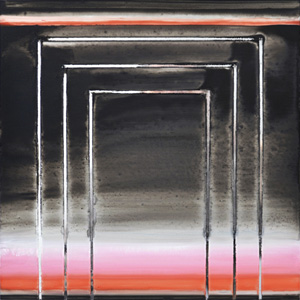
Lisa Beck can. A show called "You Are Here" places one face to face with painting as literally a mirror. Some works suggest a night sky aglitter with stars, like encroaching darkness for Emily Nelligan. More often, she sets out concentric rectangular arches, pierced by thin strips of the actual mirror behind them that seem to collect light from the painting itself. One might think of their cloudy streaks of red, brown, and gray as shades of black or white. If there is a "zombie formalism," here it still haunts the night.
All over one's hands
Maybe blacks in painters from Franz Hals to Ad Reinhardt and from Jackson Pollock to Cy Twombly and Frank Stella emerge only slowly, to become colors all their own. And maybe colors set side by side, as in Impressionism, can approach nature's white. Maybe photography in black and white depends on shades of gray, and maybe every shade of gray flirts with the clarity of black and white. Maybe all that black and white insist on the sublime. Maybe they speak of absence, in order to take one into the past. Maybe as art object they spill out only gingerly into the present.
Maybe, but John Divola and Andrea Longacre-White are not buying the pretension. Divola calls his exhibition "Clive Wearing's Dilemma," after a patient with neural injury who could live only in the now. In lieu of a press release, Longacre-White has an artist's statement, with the shattered syntax of damage to speech centers and the insistency of free association. She writes of hair, skin, drips, sweat, and sweating together in the studio—and could she really have married someone named White? Both artists display large prints in which black spills nearly to the edges of a vertical field. Longacre-White adds two somewhat neater black rectangles, as liquid latex on the floor.
You may not want to know how it got there, but be warned—and of more than just the slippery floor. (The gallery has a reminder to tread carefully on the way in.) Her prints, of inkjet and its "sweat," are a reminder that a leaky cartridge can obliterate the image and get all over one's clothes. His photos began with his physical intervention. He painted eight surfaces freely before dousing them with flour, shooting them with a box camera, and enlarging the results to show every accident of gesture or exposure. Both remind one just how messy black can be.
Neither is exactly glorifying impulse and expression, like a return to "action painting" or the "beyond black" of Pierre Soulages. Divola's title may promise an eternal present, but the series dates from 1990. Born in 1949, he studied in LA with Robert Heinecken, who kept returning to the female body as seen through pulp magazines and TV. Divola sees the body through the medium and the medium through the body. He also places it effectively behind a black wall. The top border of most prints retains the horizontal smear of a contact print.
Longacre-White, too, may seem to hold everything at a distance, behind a black tarp. Then again, that layer adds yet another bodily exposure. Her laptop, her gallery notes, may hold not just of art but also sex pictures, and she titles a print Restraint Gesture. Besides ink, her prints also incorporate staples and used "restraint tape." (Is there any other kind?) The work also recalls her studio in the 1990s, although the prints date from 2014 and stains on the floor from just the other day.
One need not relate to S&M or LA conceptualism to take them personally. One need not even worry all that much about quality, in works from more than twenty years apart that look strangely alike. They are discarding Reinhardt's promise of the ultimate end of art, in favor of another kind of black. Relish it. Divola finds the dirty work behind photography, while Longacre-White finds analog processes in a digital medium. Both threaten to get all over one's hands.
Three kinds of line
León Ferrari and Kerstin Persson weave a fine line. Their works on paper have the delicacy and precision of graphite. No human engraver could achieve such detail or bundle so much light. Few would spend so much time on little more than sticks and stones. Just be sure to ask how it is done. The answer pushes both their art fully into space.
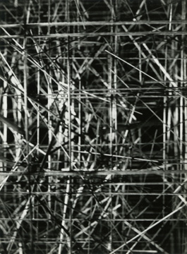
 Ferrari plays the traditionalist even when he is doodling. For MoMA in 2009, alongside Mira Schendel, he treated free writing as drawing and wire sculpture as drawing in space. His collage stuck to quite traditional imagery. Here the Argentinean adopts familiar media to the familiar purposes of abstraction, only one might not know it. Narrow sheaves fill paper to its edges, radiating light. Dark verticals and horizontal planes outline unforeseen depths.
Pencil on paper like this takes discipline, but these are photogravures from the late 1970s. Ferrari constructed their models in his studio, even if they belong in the end to a fictive space. How many different models has he recorded, and how often has he altered them? How often does he just alter the point of view or source of light? One can see the works as individual constructions, a process, or a series. Either way, they have an eye to line, space, and light.
Persson, a Swedish artist, does use pencil, a medium that demands close viewing, on paper that she cuts herself. One can admire her soft textures while appreciating the hardness of her subject, a stone. One might well rush past the actual stone, on a pedestal, to contemplate her shades of gray. Yet each drawing takes the point of view of its actual place in the room. Together, the series describes it as an object in space. Rock, paper, and scissors make a winning game.
After all that, may I end with color? Kate Shepherd generates her line digitally. Maybe a younger artist cannot help it. Her show's title, "Fwd: The Telephone Game," already places it in cyberspace, where the game of telephone tag involves the forward command. Just take that story with a grain of salt. This work is entirely between her and the viewer, with drawing as an entry point into light and space.
Shepherd layers oil on enamel, so that oil pools the light while enamel reflects it, much like pigment and vinyl for Juan Uslé today. She stacks some tall panels, like a hard-edged Mark Rothko. and one pair has the colors of sky and sea. Others stick to monochrome or (yes) black. Jagged white lines, incised into the surface, are as lithe as a Matisse cutout, while hinting at a smooth, unfolding dance. In the past she has painted on the wall, engaging the architecture. Here she runs with her intuition, to overflow computer models and pictorial space.

"Black" ran at Sylvia Wald and Po Kim through December 13, 2014, Caroline Bergvall at Callicoon through February 15, Ann Purcell at Berry Campbell through February 7, Lisa Beck at Jane Kim/33 Orchard through November 9, John Divola at Wallspace through October 15, Andrea Longacre-White at Nicelle Beauchene through October 5, León Ferrari and Kerstin Persson at Josée Bienvenu through October 25, and Kate Shepherd at Galerie Lelong through October 18. A related review picks up John Divola in 2022.


