The Splat of the Living Dead
John Haberin New York City
Gallery Going: Abstraction in Spring 2006
Zombies are on the loose again. People have called painting dead so often that abstract artists have every reason to flee the studio in fear of the living dead.
When this webzine began, I took a pretentious title (not to mention one less catch in search engines than, say, "New York Art Crit") that I have regretted ever since. Yet as Postmodernism and Art History suggests, I hoped to reconcile very contrary impulses from its very beginning. I have a real attachment to a conservative canon, but I hoped to help others, too, see it through critical perspectives. I made new media an early theme, along with an art market that thrives on excitement and overkill. Yet I keep finding excuses to look at painting in silence. 
Once again in spring 2006, artists are finding fresh excuses to keep abstraction alive, too. While other artists this season pursue darker, more obscure visions, Robert S. Neuman does it the hard way, by navigating the twists and turns in along career as a painter. Thomas Nozkowski continues to focus on one critical moment, when painting seemed closest to death. Meanwhile, Kurt Lightner and Kelley Walker allude cleverly to gestural abstraction while layering on the images, whatever they may portend. Together, they offer at least three separate approaches to the painterly—a give and take, a tiptoe around it, and a wild embrace.
Sketches of Spain
Who would not want to stumble on a forgotten master? Based on just one image, I wondered if I had. However, Robert S. Neuman's work spans fifty years, starting in the very thick of things for an abstract painter, the early 1950s. After a longer look, I may have my doubts, but he forces me to adjust my history of abstraction nonetheless. Neuman himself tries to encompass much of it.
Neuman emerges from the Midwest and studies out in California, just when Abstract Expressionism is emerging, and so is Bay Area art. In Germany, he encounters postwar bleakness and another expressionist tradition, and he responds with Black Paintings, not all that far off in time from the nasty early monochromes of Robert Rauschenberg. In the 1960s, he incorporates geometric signs, just when others might have seen Pop Art through the eyes of geometric abstraction. Robert Rauschenberg also responds to light and landscape on visits to Spain in the late 1970s, not unlike the experience in Europe of Joan Mitchell or Cy Twombly. In Montana he discovers Native American art, like Gabrielle l'Hirondelle Hill in British Columbia, not long before other cultures and outsider art were to demand attention. He teaches in well-known departments and chairs one, but always beyond New York City.
In short, Neuman stayed very much a part of things, except when it came to a career. Plenty of women might offer the same intriguing story, such as Lee Bontecou after she moved to Pennsylvania or Janet Sobel after she left Brooklyn. So, even today, can another woman abstract artist, such as Duston Spear. Can a white male from academia broaden the picture, too? I have mixed feelings, but I appreciate the obligation to ask.
As his many changes suggest, Neuman makes it easy to admire the discoveries he is making. Some of his work from the 1950s has the staid, if relaxed feel of much abstract art one used to see on Madison Avenue in the 1970s, back when it meant an elegant refusal to accept Minimalism. A white mass rests comfortably off center. One can admire the skill or want something a good deal more. The bubbling circles leave me utterly cold, but I do respect how much they exemplify competing cross-currents, and younger graffiti artists may make them more relevant.
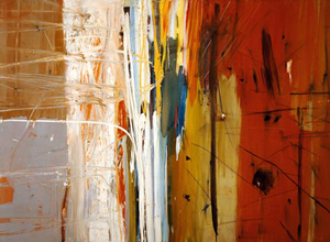
Still, I sat longest for the Spanish works. Not only does light enter, but geometry becomes fully a part of the work, rather than a compositional element alone. Four pale panels dominate one wall with their rising shapes. Large bands and brush marks in bright landscape colors connect and disrupt their surfaces. Mostly, however, I would hold out for one painting, with verticals of its own. Plaza Real, from 1958, adopts near symmetry, at least in black and white, but in color it positively explodes from left to right.
A vertical band divides neatly between slate gray and a woody brown. Thin white strokes blend with the paint and draw the eye across toward the center. The verticals there—first of bright white and then intense yellow, blue, and green—grow thinner and reach fully the height of the painting, as if under intense compression. Finally a plain red field expands, marked increasingly with black, like a letting go. One does not, no doubt should not, describe art this way any longer, as a psychic trauma, but I guess that estheticism amounts to one of the show's temptations.
From blobs to patterns
If Neuman occasionally dances with the painterly, Thomas Nozkowski tiptoes around it. For an abstract painter, Nozkowski never quite adheres to the pattern, and I mean that in both senses: he likes experimenting with his images way too much to stick to either a formal or a theoretical design. However, his latest work toys more overtly with pattern breaking, and it gives his work a much-needed punch.
In a sense, Nozkowski's career fits the mold perfectly. He has shown at one gallery for fifteen years now, starting when abstraction's death seemed most certain. He still works in oil on linen, with resolutely two-dimensional areas of color. Even when the blobs approach something biomorphic, they refuse interpretation. Other artists have sought to renew the formalist mantra of painting as object, either by painting on three-dimensional household objects or by working with the similarities between painting and plain old fabric design, as in clothing or folk quilting. Nozkowski, in more than one way, does not follow fashion.
However, while he may not shift with the wind, he seems equally casual when it comes to the dominant formalism of some years ago. He works small, his colors range all over the map, and his images do not derive from the painting's edge. He treats background and image alike as a colored object, but he does not subordinate one to the other. One can see him as at once less rigorous and less subversive than Elizabeth Murray and Murray drawings, but he probably just hates anything that would pin him down. Of course, he also runs the risk that one will not see the need to bother. Maybe that explains why I had never much responded to his work before but am enjoying his new sense of play.
The new works allude more often to the grid, which allows them to keep finding ways not to follow it. Some divide the canvas horizontally, but hardly evenly, as if something had torn into the painted ground by mistake. One has something of a picket fence of bright color, with just enough jagged edges to resemble collage. In another, a thin blue curve connects white areas, each with a red dot at its center, like birds or paper kites by Joan Miró in his Dutch Interiors. Beneath, tiny white and yellow shapes against a blue field give the illusion of a grid warped by the fall of light or by twisting in three dimensions. The work still feels small and unassuming, but it helps me remember why one ever cared about abstract painting in the first place.
So, concurrently, does Mark Sheinkman. Like two years before, he probes deeply into the shallow space of a Jackson Pollock, like that of Pollock's Mural. However, like Ellen Altfest this very winter, he makes it an excuse for a feat of illusion. His curves seem to glow and expand against the darker painted ground. Like him, Nozkowski, too, gives one occasion to ask whether formalism still means anything—and if not, whether to enjoy it that much more.
One way, then, to keep abstraction alive is simply to live long enough, like Murray. It may help, too, to spend those years conveniently away from the New York scene, like Neuman. Another is to look back on the 1970s with love, anger, or whatever other passion they inspire, like Nozkowski . Past reviews have often explored further strategies, from close respect for the abstract image itself to lathering it on. And never mind concern for resolutions.
The microbiology of blackness
Two shows, however, recall Pomo's glory days, before irony was dead, but with a fondness for two dimensions anyway. In different ways, Kurt Lightner and Kelley Walker layer it on, in order to reveal painting as one more sign system among many—perhaps a touch creamier than others and a lot more impulsive. The 2006 Whitney Biennial shies away almost entirely from traditional media—precisely when drawing, prints, and the artist's book are flourishing. Yet somehow or other, Walker feels right at home there as well.
Lightner takes it past Eleventh Avenue, one more sign of Chelsea's formidable reach. His roots definitely lie in nature, as in his colorful Patch of Grass, meticulously drawn in acrylic ink on Mylar. However, the tufted image, trompe l'oeil illusion, and translucent ground already show an interest in what modernists used to call pictorial space. For much the same interplay between two and three dimensions, Lightner makes full use of Mylar's lightness, as a collage element. His underlying watercolors provides a landscape. Above, brightly colored spores and other plant-like shapes cluster and grow.
The artist talks about "the strange symbiotic relationship between landscape and man-made structures," and surely those structures include painting. Terry Winters might have invaded suburban America, and art school might have started requiring a microbiology. Lightner has received critical acclaim for an assault on what he calls "our ability to control anything." I see instead light, engaging structures that run the risk of undue simplicity. Thankfully, however, his skill with acrylic controls a great deal indeed.
Where Lightner's simplicity risks glibness, so does Walker's complexity. He, too, throws blobs around with abandon and piles on the layers. A white postmodernist whose collaborations with Wade Guyton as Guyton/Walker seemed obsessed with Ketel One vodka ads—their Fraktur calligraphy no doubt a sign of the nexus between capitalism, Fascism, and strong drink—he parodies Modernism, right along with the culture of consumption, race in America, and the mass media that filter all of these. Yet his entries in the 2006 Biennial look at first like good old gestural abstraction. They stick to a limited palette of red, white, and black, and the pours, blobs, and splatters appear indecipherable. Only their sheer awfulness saves the compositions from fatigue—or so it seems on first glance.
Of course they have a subtext or two. One underlying image looks so flat because it reproduces an old photograph, of police dogs mauling civil-rights workers. The blurred scratchy outlines echo Andy Warhol silkscreens on much the same subject, and printing in red alludes to a Coca-Cola logo captured within the image. One can imagine the shot of police updated as an ad for Red Bull, leaving Coke all to Warhol himself. Even the black and white plays with racial stereotypes and consumer products, for Walker has substituted chocolate for paint. More than at the Whitney, the gallery versions still have a thick aroma, and one hesitates to call it alluring or repulsive.
Walker's other work comes closer still to Pop rather than abstraction, but it continues to play with the same multiple sign languages. Magazine ads get tweaked, especially when they market blackness or danger. The apparent paint over them may start as toothpaste, but even that gets reduced to an image in a print medium. And if the result makes Artforum, he appropriates that in turn. Racial politics and sign systems alike loose their definitions a step before he can leverage them or destroy them. And yet the splatters and signs alike make me enjoy wallowing in the escape from politics and the mass media into art.

Robert S. Neuman ran at Allan Stone through March 4, 2006, Thomas Nozkowski at Max Protech through March 18, Mark Sheinkman at Von Lintel through March 25, Kurt Lightner at Clementine through March 11, and Kelley Walker at Paula Cooper through March 25. As a postscript, when I say that Nozkowski has shown at one gallery for fifteen years, Max Protech is since gone, and the Pace has picked up the artist.


