Impurity as Clarity
John Haberin New York City
Abstract Gallery-Going: Larry Silver and Marjorie Welish
The 2008 National Academy Annual
Remember Pop Art, Minimalism, conceptualism, neo-expressionism, Postmodernism, feminism, and . . . I forget. The -isms of art's past half century may not have much else in common, but pretty much all first came to attention as assaults on the idea of "pure" painting. In one sense, they succeeded beyond their wildest dreams. By the 1980s, not just purity but painting found itself declared dead. By the end of the century, impurity had triumphed in a way that no one had ever intended, as pluralism. 
If art is going to cut through the chaos and complicity, perhaps it needs a map. In spring and summer of 2008, more than a few artists turned to abstraction for just that. In different ways, they draw on color-field painting as it played itself out in the 1970s. They look to its styles, its structures, and its obsessive self-reflection, but without a hope of purity. One could almost call it post-post-painterly abstraction. The details can carry weight because they do not take the ground for granted as a preexisting structure.
Larry Silver could be working fervently over a monochrome surface, or he could be cutting through it and cutting it away. Marjorie Welish, who has basically sustained her practice through abstraction's good years and bad, also comes closest to mapping the dilemma. Last, the 2008 National Academy Annual leans on the past more for style than critique—but that, too, helps elucidate the changes.
Scratch and sniff
It may sound silly to assault fine art. Does anyone still believe that much in art, outside of auction houses? Still, the assault is on, because it is fun—and because it, too, makes a case for the present. In the clutter and litter of "Unmonumental" at the New Museum, the 2008 Biennial, Tom Burr at SculptureCenter, and so many other fine and trashy installations, the assault has taken on new life. In fact, the assault has become mainstream art. But then art movements always outgrow their initial anger, wonder, and critique.
By the same token, how pure was painting was all along? Retrospectives from the 1970s keep asking just that, and one could easily push the question back to Willem de Kooning and Woman I or to Jackson Pollock's drips. From the almost painful detail of Alexander Ross's humanoids as green slime to the endless derivatives of album-cover art, artists have been taking some very impure lessons from an impure past. Perhaps it stems from a search for respectable ancestors even for kitsch.
Installations and other sculptural fantasies do get more attention than painting—and not solely thanks to art fairs and biennials. Again and again, however, gallery-goers are stumbling on something more familiar. Photographs by Rory Donaldson and others aspire to abstraction's "Strange Magic," while paintings aspire to something always about to come into focus. Once Christopher Wool all but summed up the subordination of painting to conceptual art. Now he, too, has switched to indecipherable calligraphy. The very air of deliberate, elusive quotation from past and present complicates the mix, as if Wool still started a painting with the letters FUCKEM.
Larry Silver's new work might seem never to have given up on painting's autonomy. It has no subject, accidents, or cigarette ends. In each, rectangular panels hang side by side, sopping up the light. Their layers of oil and graphite come as close to the paradoxical buzzwords of flatness and objecthood as Clement Greenberg might wish.
And does he ever work those layers. Opaque white never quite effaces thick black curves. Scratches weather the darker surfaces. The multiple panels themselves call attention to the varieties of texture and the varied relationships between process and drawing. So do the colors—in browns, blues, and greens that make the most of small divergences from black and white. One of the three paintings looks quite comfortable hung low, settling into its horizontal space along the wall. The clay board as ground brings them that much closer to the build-up and abrasion of an early Brice Marden.
The bareness and layering make them flatter and less illusionist than even Marden's. Curves penetrate the oil rather than loop across each other. One can still look for an image in the swirls and chicken scratches, which hover near the center of a panel. Silver's titles may refer to clouds or architecture. However, they earn their impurity the hard way. The artist does not so much drag things in from the outside as rough things up from the inside.
Diagram of disorder
Painting is taking pains again. A wave of backward glances, from the retrospective of Elizabeth Murray to "High Times, Hard Times," has allowed the 1970s to get all over the walls and floor in big fields of color. One painter and teacher since those years, Jeremy Gilbert-Rolfe, has keyed up his colors and largely eliminated his characteristic fields of white, as if to insist once and for all on what matters. This year, too, came something at once messier and more finicky, starting with stripes running down through Chelsea by Juan Uslé and Dan Walsh.
They look not unlike Ken Noland stripped of all that talk of objecthood. Could it be that Pattern and Decoration never had to break with color-field painting after all, as with Larry Zox in his Open series or Frank Stella and Stella's stripes? And then I started to remember those around me in college, who took for granted the search for more intricate geometries. They spoke in the same breath of Marden and Robert Smithson—the desire to make painting speak for itself and the desire to map disorder—and a heretic like Peter Halley with abstraction as a prison cell just made the outcome a sociopolitical statement. Ancestors like these disrupted "mere illustration" and "pure painting" alike, and the terms still meant something. Attention to detail meant attention to the limits and possibilities of art.
Thomas Nozkowski has been attending to detail for some time now. One could take his abstractions for still life, microscope slides, or simply studies in how one form leads to another. Curved shapes tend to have harder edges and larger boundaries than rectangles. Opacity together with overlays allows one to view the central shape as object or part of the ground. His latest show lets curves repeat more frequently across the canvas rather than center upon it. The sheer number of small works makes their designs that much more subjective.
Perhaps the disconnect between Pace's lavish quarters and the scale of the art diminished it for me, but still at the level of everyday disappointment rather than unintended comedy. The New Museum dares Tomma Abts to remain halfway visible at all. In its large box, perhaps three times the height of a museum guard and all but devoid of natural light, it allows her barely a dozen easel-scale abstractions. They hang evenly spaced at eye level but with a single gap, as if the German artist could not quite finish the job. She might shade her less than dense patterns, like an Op Art recreation of Robert and Sonia Delaunay. Or she might let them stand, as a boast that purity can accord with anti-formalism.
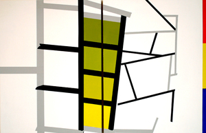
Work like this trusts the artist's impulse in a way that art immediately after color-field painting did not. For someone like Robert Mangold or Marjorie Welish, the challenge is still for detail both to catch and to disperse attention—to pursue painting both for itself and as critique of itself. The elements of Welish's new paintings certainly look familiar, but that is part of why they matter. The small panels and sheets of unmounted paper include color rectangles, relatively neutral white areas, pen tracings, and washes. Bars favor unpredictable angles. Bands of primary color hug, echo, and supplement the frame.
The elements could belong to architecture or, as Welish calls the show, "Painting as Diagram," but a diagram of what? The point is that the question matters. Painting here can serve as a diagram of imaginary structures, of their experience, of the gallery, or of painting itself, or it can mean painting as essentially schematic without referring to anything at all. All this sounds like a stern lecture in structural linguistics, but leaving the options open keeps the work at a remove from its own apparent formalism. Moreover, while individual works are rather discreet about their refusal to play ball, the salon hanging really lets loose. The scattered fragments, like randomly placed windows onto a larger space, make the gallery itself the diagram.
Sizing up abstraction
Echoes of abstraction's past, like Katy Moran's creamy easel paintings recently, can easily turn into pleasant academic exercises. Yet Abt's shrinking expanse and Welish's expanding ones point to another doctrine of art after World War II as well—the distinction between size and scale. Somehow that idea, too, sounds a little less pure for an age of HBO. In its 2008 Annual, the National Academy Museum strikes a conservative pose that looks back defiantly, without apologies for itself or its financial challenges even before the recession hit art. It also titles a catalog essay "Size Does Matter." Painting, it claims, can grow large or small, but it has squeezed out the middle.
Inside the Academy, size never does matter all that much. No one born since 1920 will note the now-conventional departure from easel scale. Few if any paintings in the Annual conjure up murals or miniatures anyway. The representational work seems more academic than virtuosic, although fans of Julie Heffernan will enjoy her self-portrait as late Renaissance nature goddess. Photography occurs so rarely that that the grainy acts of surveillance by E. E. Smith could pass for fine monotypes.
The occasional work in three dimensions never intrudes into real space as a Cordy Ryman corner piece did at the 2006 Annual. Amidst the more self-contained sculpture, Michael Burke carves his five page "book" out of sheet metal, like a stack of silver canvas by Jacob Kassay. Linda Ganjian conjures up an entire Mideast city from modernist underpinnings topped with curves that have more to do with Persian script than Frank Gehry. These works stand out, but they do not set the tone. An Op Art floor painting by Lisha Bai engages not just the senses, but the floor tiles as well.
One cannot, then, accuse the Annual of a preoccupation with the state of the art. Yet the Academy has a quiet charm and even sanity—starting with a touching and exhilarating work by the late Robert Rauschenberg at the foot of the glorious winding stairs, with a skeletal image at its center. Every other year the Annual goes beyond Academy members for a juried show, like the annual show at Hudson Valey MOCA, a tradition that combines the more contemporary virtues of a biennial and an exhibition of emerging artists. A handful of established painters set the tone, including unusually compact but dense translucent swirls by David Reed, who curated a survey of the 1970s in the same rooms just a year before. The lucid rectangles of Pat Lipsky really do aim large, and a wall of Rust Prints by Leonardo Drew brings out his love of found textures from an older industrial New York City. Sean Scully slides an inset right into the canvas, like an illusory gray chest of drawers by Jasper Johns, and his oil colors grow all the more solid for the disruption.
Newer names than Jasper Johns, too, recall the 1970s. Their off-kilter takes on color-field painting might have pleased Al Held or Jules Olitski—whose daughter Eve in fact appears. With so many unthemed rooms, it seems difficult or even criminal to single anyone out. The same affinities inspire C. Gregory Gummersall's sharp acrylic colors over collage, Melissa Meyer in her reduction of controlled brushwork to wash textures, and Elizabeth Gourlay's thin parallels over looser areas of color, like a darkened Agnes Martin or a lightened Paul Klee. When hints of representation slip into abstraction, they can perk it up, too, as in Regina Stewart's Untitled Journey. David Collins sustains the tumbling imagery of Marcel Duchamp in Tu M' but without the assault on painting. This exhibition would not tolerate bad manners, but then again the twenty-first century has embraced art, too.
In more than just the last ten years, this Web site has tracked artists who argue that abstract art is coming back from the dead—or the cutting edge. It has followed celebrations of the changes bubbling under the surface back in those "High Times, Hard Times." It has watched painters mimic Abstract Expressionism, but as a lesson from the past. Will a time of transition, between Modernism and irony, supply a way out? Not really, as long as looking backward is already postmodern. Maybe it merely attests to a hunger for sincerity and irony, even or especially if they contradict each other.

Katy Moran ran at Andrea Rosen through April 23, 2008, Alexander Ross at Marianne Boesky through April 19, Christopher Wool at Luhring Augustine through June 21, Larry Silver at Lesley Heller through April 26, Jeremy Gilbert-Rolfe at Alexander Gray through June 14, Juan Uslé at Cheim & Read through March 15, Dan Walsh at Paula Cooper through March 29, Thomas Nozkowski at PaceWildenstein in Chelsea through May 3, Tomma Abts at The New Museum of Contemporary ArtThe New Museum of Contemporary Art through June 29, and Marjorie Welish at Björn Ressle through June 7. The National Academy Museum held its 2008 Annual through September 7.


