Color Blindness and Insight
John Haberin New York City
Color, Art, and the Mind's Eye
"The Case of the Colorblind Painter" would have nowhere near its intensity without an artist's sensitivity to color. Jonathan I. found shades of gray "rat colored" and disgusting. He hated color reproductions of his favorite paintings. He had to shut his eyes to eat.
Yet he also developed acute night vision, and in time he chose to live in black and white. He ate black olives and plain yogurt. As described by Oliver Sacks in 1987, he turned from paintings of violence and rage to a "whole new world" of "form, contour, movement, depth." He had revisioned, painfully but completely, the close tie between what an exhibition in its subtitle calls "Color and the Mind's Eye." 
From description into crisis
Technically, it was the world of cerebral achromatopsia, described by Robert Boyle in in 1688, but it came to be something more. A painter who hated the sight of people like "animated gray statues," he found that in the studio "he could reconceive the world in powerful, stark forms." He had moved among centuries of art, from realism to expressionism to classicism and back again—all under the emotional demands of the brain and an inner eye.
Those poles have consumed artists, because optics is not just physics. Nor is it "all in your mind." Rather, it is a complex interplay of neuroscience and light, of inner and outer worlds. For art, those poles just happen to include convention and creativity, but so often has science. For ancient Greeks, the spectrum did not always distinguish red and green, for they privileged intensity as a guide to both mental activity and sculptural form. They even sound a bit like Jonathan.
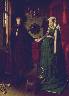
The seventeenth century established the wave nature of light, but the earth and alchemy had revealed its riches long before. Jan van Eyck and the Northern Renaissance did not discover oil painting. Rather, they rescued oils from fit only for (seriously) interior decoration, as their jewel-like luster came to seem as worthy of God or nature as tooled gold. Titian in Venice packed the known range of pigments into a single painting, while moving away from unmixed colors. Pieter Bruegel explored atmospheric perspective, much as Leonardo described it in his notebooks. Each was a step in the parallel development of art and optics, but parallel lines have a way of not meeting.
The big break for both came in the nineteenth century, with the first modern color wheels and the Romantic imagination. Eugène Delacroix spoke often and with enthusiasm of his sheer delight in color, but before long J. M. W. Turner was pushing it past observation and toward apocalypse. With Impressionism, one even had a choice of crises. One could follow it to Fauvism, Expressionism, or Cubism. The last, for a while, almost did without color. Art as a window onto nature is too powerful to reduce to prisms anyway, unless you are a huge fan of album-cover art for Pink Floyd.
Physics had much the same course from description into crisis. It explained light as the interaction of electric and magnetic fields, but by century's end the wave theory was breaking down. Particles of light have colors governed by their energy. Energy levels within the atom in fact account for the properties of matter, like the raw pigments that Anish Kapoor has piled on the floor. Artists have not had much to say about quantum theory, but they have made out quite well with its products in mass-produced paints, florescent tubes, and new media. Philip Ball has given them all a marvelous history, in Bright Earth: Art and the Invention of Color (2002).
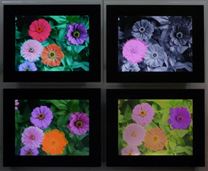
Can realism co-exist with colorblindness—or only disgust at shades of gray? Adrienne Klein makes realism that much stranger still, with flowers that veer suddenly in and out of color. Their variation across frames is unpredictable, even as their fixed locations suggest the actual rods and cones of the eye. Peter Thomashow's assemblages combine eighteenth-century experiments with color's set free from their reference, while Julie Shaw Lutts hints that science and optics share a secret history. Her Optical Time Machine looks prepared to collect, to diagram, or to destroy the components of vision. Then again, it may just be left over from a long time ago.
Enlarging the Spectrum
Not surprisingly these and other artists in "Now You See It" are pretty much traditionalists at heart. At home on paper and among artist books, they cull old pages and scientific diagrams, like David Powell and Sarah Stengle. They lean to color as patterning, like Gerhard Mantz, David Ambrose, or Nola Zirin. They combine realism with expressions of formlessness, like Kirsten Hoving's refracted books and journals, or with expressionism, like Martha Hayden's spooky permutations of a single object. Gareth Long's images may resemble viruses, but photograms like his precede true electron microscopy and X-ray diffraction by many years. Katherine Jackson's intricate traces of white on cut glass may evoke particle tracks, but just as often decorative media or the palace and precious bindings of Versailles.
Some get a bit more high tech. Kate Temple has worked with zinc plates and Klein with artist holograms. Her series on her mother's loss of sight and on the rods and cones of the eye look to the fragility of perception. Still, Chuck Close is quite happy with old techniques and old media. He can build faces out of loose loops of color, because his color is also a means toward gradations of light and dark. He is not so far from his early photorealism in black and white—or, for that matter, from Jonathan.
 As few as 0.001 percent are born color blind, although more have abnormal red-green vision—mostly men, for the defect resides on the X chromosome. Others suffer damage to the retina or, like Jonathan, the brain. Still others have color agnosia, the sensation of color without its knowledge. They may know when a drawing is correctly colored, but they cannot give the colors a name. Everyone, though, is a little color blind. One thinks of vision as photography made flesh, but the actual spectrum extends well beyond visible light, and x-rays can expose film.
The cones (which deal with color) also lose sensitivity in low light. They find instead the ghostly isolation of a night scene by Edward Hopper in Hopper's New York—or the dazzle of mirrored reflections and artificial light that Edouard Manet gave a A Bar at the Folies-Bergère. That loss also helps explain the shock of a pool hall by Vincent van Gogh. Its reds, yellows, and greens must have looked stranger still before the eternal daytime of Times Square. Jan Vermeer may have worked in the dim light of a camera obscura, but he then had plenty left to do. The brain can also improve on cameras, which is why snapshots often end up with a washed-out sky behind an underlit interior.
The poles of outer and inner worlds are never simple, any more than one can reduce Picasso and Matisse to a rivalry of line and color. One remembers Giotto for the sculptural form of human actors seen from the back. One enters the Arena Chapel in Padua instead to an explosion of blue, across painted skies and a decorative ceiling. Artists in between understood the passage of light through oils. Yet they found more truth in reflection than refraction, like Diego Velázquez in Las Meninas or Parmigianino in Self-Portrait in a Convex Mirror. They also found more ways to lie.
When it comes to art and science alike, most people are still stuck in the nineteenth century. Color came closest to a science with Post-Impressionism, but that science has supplied more than its share of soothing reproductions for dental offices and middle-class homes. Nor is that solely a bad thing. Claude Monet pioneered Impressionism, but he also painted his Waterlilies while going blind. Both were demanding, and both led to Modernism. Both were true in their own way to art, to nature, and to sight.

"Now You See It: Color and the Mind's Eye" ran at Central Booking through October 23, 2011. This review expands on a catalog essay. The essay by Oliver Sachs first appeared in The New York Review of Books and was republished in 1996 in An Anthropologist on Mars. A related article looks at artists who combine abstraction, color charts, and text.


