Ecstatic Dots and Dashes
John Haberin New York City
Tauba Auerbach and Ecstatic Alphabets
Jaq Chartier and Catherine Lee
Kathy Goodell and Harriet Korman
Some of the most ravishing work today makes it hard to tell painting from photography, abstraction from representation, or text from the artist's vision. Painting is back, big time, but the late modern dream of pure painting is not. For many of the artists in "Ecstatic Alphabets" at the Museum of Modern Art, the chilly texts of Lawrence Weiner or the date paintings of On Kawara are history. They are finding not pure color or pure language, but signs and surfaces together. 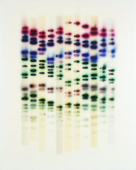
Tauba Auerbach, for one, makes her most massive contribution with just three letters. They stand for the three colors from which the human eye fashions vision—and they are not red, yellow, and blue. Oh, and not one of the letters appears in print. If she sounds like a puzzle, so does much art beyond MoMA. Angry at the art market and at big-ticket installations, some painters are calling for a return to the handmade, like dark color wheels for John Mendelsohn. They may find instead that something as simple as a color chart adds layers of conceptual art.
Take several recent gallery shows. Jaq Chartier paints her own eye charts, while Catherine Lee invokes the textbook on light, in quantum mechanics. Kathy Goodell takes optics so seriously that she redoes Damien Hirst dot paintings by hand, only to refract them through lenses. Harriet Korman finds asymmetry in geometric abstraction solely thanks to color. Together, they suggest an important alternative to hybrid forms and hybrid media. It lies instead between dots, dashes, and vision.
Just three letters
"Ecstatic Alphabets" draws on the museum's works on paper for everything from language poetry and Gregory Corso's "Dial-a-Poem" project (where your "mobile phone fees apply") to John and Yoko, with their poster for peace. Subtitled "Heaps of Language" (a quote from Robert Smithson), it brings together generations of art and text even before Lawrence Weiner, Jackson Mac Low, or On Kawara. Historical works line a corridor carpeted Walk Talk, from Ferdinand Kriwet in 1969. These lead to twelve contemporary projects—like objects as Found Fonts by Paul Elliman, language set into landscape by Shannon Ebner, or language as the human mark itself, carved into marble by Trisha Donnelly. For Nora Schultz the entire apparatus of offset printing looks, as she calls it, The Discovery of the Primitive. As with the numbers 0 through 9 for Jasper Johns, context shakes up art while art shakes up language.
Each of three case-bound volumes by Tauba Auerbach has clean edges and a cloth cover, and each glows. As it happens, the eye has receptors for red, blue, and green—and each volume follows just one of those colors, from excess to emptiness. Pages of the little red book, for example, become progressively divided between green and blue. For those mathematically inclined, think of a change in color axes as a coordinate transformation in three dimensions. Auerbach's three color cubes make visual and physical that third dimension. They stand at once for three books, three letters, and three components of vision.
Auerbach also displays The Whole Alphabet several times over. Here she dismantles and reassembles not so much unseen letters as unnamed fonts, like a deconstruction of text that leaves language intact. She dismantles both color and letters, too, in a phonetic poster, How to Spell the Alphabet. Perhaps she has always seen text and color as enigmas. Back in 2007, as part of the Whitney's Independent Study Program, she placed all the letters over one another, like a tribute to the pounding of typewriter keys. In the first New Museum "generational" she played with dots, like Op Art without illusions.
In her latest gallery show, two sculptures on pedestals return to books. These crystals taper so as to retain the main axis of a book with varying translucency. One room then uses photography and printing to create stippled strips and more books, this time seemingly caked with rust. They suggest another way of moving into three dimensions. Think of text at its most basic as communication—a line from sender and receiver. With bound books and with color, line becomes space.
The rest of her solo show includes two series. One, which first appeared in the 2010 Whitney Biennial, uses an industrial sprayer to depict the shallow space of folding and rumpled canvas. The second uses actual folds to create light and dark, with flat canvas strips woven into squares. Both have a parallel in Sam Moyer, with her own illusion of rumpled canvas and photography, although in actual bleached and ironed fabric. They also supply a kind of signature, in the artist's gestures. But then spray painting, between mist and graffiti, is and is not a kind of writing.
Together the two series, "Fold" and "Weave," sound like a boxer's strategy so as not to be touched. She comes at a time with many artists work between old and new media—or between abstraction and schema. Even plain text art can appear improvised or three dimensional. Meg Hitchcock, for example, recreates sacred texts letter by letter with a knife blade, as true ecstatic alphabets. Like them, "Ecstatic Alphabets" navigates between concept and illusion, in two and three dimensions. And some pleasures still come down to colors and surfaces.
Quantum mechanics
Jaq Chartier obsesses over something as simple, at least for an artist, as the color wheel, but also the science of personal identification. Like another believer in soaked color, Mark Rothko, Chartier uses paints susceptible to sunlight, so that they fade or deepen into brown. They change slowly, though, and the artist calls the show "Slow Color." Critical opinion is starting to turn on conceptual art in favor of the handmade. That could mean that the first has run its course—or that both have run together all along. Here both become the rigorous signature of the artist, but for Chartier every departure from the impersonality of abstraction is laden with anxiety.
 She claims to use her Large Spectrum Chart for reference while she works. A commercial color chart might look breathtaking in its own way, but not half so rich in color. Richer still are paintings inspired by gel electrophoresis, a technique used to separate complex biomolecules for further analysis—but the forces guiding the deep stains are gravity and time. One can see the rows and columns as natural processes or as one's very own DNA fingerprints. The raw sensation of color enters the anxious associations of forensic or scientific scrutiny. And neither one can erase the marks of the artist.
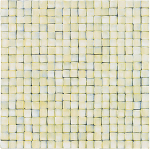
Catherine Lee brings the handmade to denser patterns of squares (or, for the adept in Morse code, maybe the dashes to Chartier's dots). Lee has one looking as closely as a scientist. She packs squares tightly, in variations on monochrome. She also makes sure that the cracks are showing. She calls them Quanta, as in quantum mechanics, for the best of both light and matter. Quantum mechanics could also stand for the uncertainty that dogs art even at its most formal or mechanical.
Lee's favorite colors pay tribute to Ad Reinhardt and the primaries. She also leaves every brushstroke visible and then some. Oil on board, about the size of an open hand, stresses the sheer labor of assembly. Easel-scale work on canvas has more room for variation in shading and intensity. One can often see a second color as coarse lines between the squares and, below that, a ground. That might mean black on white or white on black.
As with wave and particle, one gets to choose. Should one see lushness or austerity, depths or the picture plane, the self-evident or the hidden? Lee brings material to the surface rather than in perspective, like much late Modernism, and it can feel palpable or claustrophobic. Think of the early black tiling in Willem de Kooning or the very title of his white Attic. Another wall holds red ceramics, like ancient tools, with wire wrapped tightly around the neck between blade and handle. Dig in.
Carlos Estrada-Vega pushes austerity so far that the dashes become squares—and he pushes lushness so far that the squares become solids. He in fact describes them that as cubes, although they stop short at pigment, limestone dust, and wax of varying depth. He places these as multicolored tiles on a square field, in what he calls "Building a Painting." I admired the tactility while not quite wanting to touch, much as for another intriguing example, Xylor Jane, for whom raised points of white form numbers with the surface texture of the microchips to compute them. Standing back from both artists, the static arrays led nowhere. Walking past on the way out, though, color became a true third dimension, rippling across my field of vision.
Skewed dots and diagonals
Would it really help if Damien Hirst had made all those dot paintings himself? On first glance, Kathy Goodell's centerpiece could pass for yet another of Hirst's products, on a twenty-four foot scale that he would surely approve. She might, by the sheer fact of producing it, have entered his workshop despite herself. Yet she treats each dot as a drawing to itself, later affixed to canvas. Ink becomes her signature, and the waterproof paper allows it and acrylic to run freely under her hand. Her method allows for both spontaneity and composition, as the placement of dots creates larger pools of light and shadow.
She has more sketches for sale, although one cannot peel off dots and take them home, like coffee cups by Gwyneth Leech. Still, Goodell does have a conceptual side. One can treat the wall as an installation, passing among hanging lenses that give scattered glimpses of the whole. One approaches the entire exhibition by way of photographs anyway, each a fisheye distortion. She even calls her work, too cutely for my taste, Mesmer Eyes. One moves through her work, from asymmetry to geometry and back—and from the personal to the distant and strange.
 I could be looking way too hard, in a gallery not exactly known for experiment. And dealers do need something to sell along with an installation, like photographs and drawings. Still, Goodell embraces both beauty and paradox, Postmodernism and tradition. She is not alone. Three years ago, a show highlighted color charts, as a device to reinvent color. More recently, one show linked "Color and the Mind's Eye.
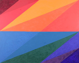
When Roy Lichtenstein spoke in praise of "mechanical subtlety," he could have had her in mind—or Harriet Korman. Korman, who has exhibited since 1970, shares her patterning with Minimalism and the decorative arts, but then the colors take over. You may have to look several times to make sure of the symmetry before your eyes. You may also forget how rarely stained glass sticks to abstraction. Her paintings recall Paul Klee. They also approach Synchromism and the luminous.
Her designs take only a ruler, but the skewed lines suggest motion, much like asymmetry for Piet Mondrian and Mondrian in America. The two paintings with reflection symmetry alone sit relatively still, with more opaque color and nested smaller shapes. Instead of Mondrian's twentieth-century New York, though, they have a place apart. The others have rotational symmetry, with one explicit diagonal and other lines drawn to the endpoints of a central horizontal or vertical. They immerse one in the calm intensity of oils and the tumble of extended triangles. I could imagine them overhead, like architecture, letting in the light.
Maybe it comes back to the old dogma of Modernism—that before anything else, a painting is an arrangement of colors. To judge by Quayola, a few centuries after anything else, too. The London-based artist converts the "topologies" of Giambattista Tiepolo, Tiepolo's skies, and Diego Velázquez into prismatic videos, with rare hints of what went into them. His Strata do much the same to Anthony van Dyck and Peter Paul Rubens. Does he clarify the structures or remind one that Las Meninas or a Velázquez portrait was quite cryptic enough (thank you)? Maybe both, but do not overlook the ecstasy.

Jaq Chartier ran at Morgan Lehman through April 2, 2011. "Ecstatic Alphabets" ran at The Museum of Modern Art through August 27, 2012, Tauba Auerbach at Paula Cooper through June 9, Catherine Lee at Galerie Lelong through April 28, Carlos Estrada-Vega at Margaret Thatcher Projects through June 23, Xylor Jane at Canada through June 10, Kathy Goodell at Causey Contemporary through April 16, Harriet Korman at Lennon, Weinberg through April 14, and Quayola at Bitforms through June 16. A related article ponders art and optics, with "Color and the Mind's Eye."
