Lightweight
John Haberin New York City
Richard Tuttle
Go ahead. Call Richard Tuttle a lightweight. I dare you, and so does he.
The solidity of lightness
Not that he lacks substance, although anyone who calls a three-inch-tall wire twist a portrait has managed to keep his sense of humor. Not that he takes light itself as his medium either, although his Whitney retrospective does devote a room to his Light Works. Naturally, that means derelict constructions using light bulbs. And his light touch extends to the open space of a gallery and to the shadows cast on the wall. 
No, I mean literally light in weight. If Minimalism makes one think of monuments in metal and earth, Tuttle's assemblages largely cling to the walls and floor. If Richard Serra with his Tilted Arc defies gravity, Tuttle's rope trick consists of a finger's length of clothesline, frayed at the ends and nailed in place. His idea of panel painting uses plywood and wafer board. His approach to a painted canvas amounts simply to dyed fabric—cut, shaped, and sewn. He prefers ordinary light bulbs to industrial-strength fixtures.
Minimalism famously reduced art to its elements, with the grid its alphabet and the gallery its storybook. Tuttle seems to pare Minimalism down to the point where it will blow away. At his first Whitney exhibition, in 1975, much of the work in fact changed places from day to day. A few pieces do so again, I understand, at his second.
Do not let that fool you, however. Thirty years later, the controversy over his earlier show has long blown over, but Tuttle's art has not blown away. I may not always find his retrospective as earthshaking as walking between Serra's walls. Yet it brings out a defiant continuity between American abstraction and the mixed-media installations so popular today.
It does something else, too: it sets out a genealogy for the reinvention of abstract painting everywhere today. As a postscript, a gallery exhibition three years later shows Tuttle as a painter. And yet there, too, the light materials hang as comfortably on the wall as if part of its architecture. In its subversive modesty, like Susana Solano and Joseph Zito, it anticipates today's Neo-Minimalism.
Tuttle's literal twist on lightweight exemplifies Minimalism quite as much as Serra's rusted steel or Dan Flavin. It also suits his quiet but persistent exploration of what art can do. Critics once derided Minimalism as hollow or theatrical. Like Bill Bollinger, Tuttle takes each solid object one at a time, and it does not become a prop in anyone's drama, not even the viewer's. When he crafts a frame as part of the work, it neither seals the art object in its own world nor projects art into the space of the gallery. It makes one wonder instead how such distinctions could ever have mattered.
From Minimalism to drawing
The retrospective's curator, Madeleine Grynszejn of SFMOMA, prefers to call his work Post-Minimalism. Tuttle admits to having one foot in that generation, like Richard Artschwager. Even there, however, appearances can deceive. Sure, his Constructed Paintings of the 1960s may suggest the shaped canvas of Frank Stella, Elizabeth Murray, Charles Hinman, or Ellsworth Kelly. His soft materials will surely recall Eva Hesse or Lee Bontecou—except when they do not.
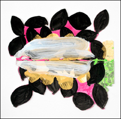
Stella created icons, and his shapes define the painted grid. Murray's outlines and colors have the giddiness of a comic strip. Kelley's, in turn, compete with the very fall of light from above. With Hesse or Bontecou, art competes with organic life. Tuttle does not embellish his surfaces beyond a single muted, unnatural acrylic shade. At times, one could easily mistake them for a shadow or pencil drawing on the wall.
He still points to something larger than life and as mysterious as art. He probably also thinks of Pop Art or much of Minimalism's theater as a distraction. Hesse's tentacles wriggle outward, toward the viewer and onto the floor. Tuttle's shaped canvas may find its way to a spot high on the wall that I had never even noticed.
Tuttle's contemporaries tend to seek a kind of greater truth in the art object. Hal Foster has even argued that any form of appropriation reiterates the Surrealist association between art and fetish. Tuttle makes one question appeals to deep truth or the unconscious. He calls one series Monkey's Recovery for a Darkened Room, but the monkeys have departed, and the bare twigs do not enclose darkness. A younger lover of fragmented painting, Cordy Ryman or Jennifer Reeves with abstraction talking her head off, surely would understand.
All this suggests a kind of modesty, but even that can lead one in the wrong direction. His minimal means and effects often infuriate people, and he seems to welcome the outrage. In rotating the installation, he both flaunts and implicitly denies its apparent fragility, like the artists in "Cutters." He may believe that Pop Art has had its fifteen minutes of fame, but the combination of the ephemeral and provocation makes me think of Robert Rauschenberg in his combines. Both also follow that old edict to take an object, do something with it, and then do something else with it.
I can think of one word that encompasses Tuttle's literalness, quirky experimentation, and old-fashioned dedication to the image at hand—drawing. His early sketchbooks construct odd shapes out of small strokes of watercolor or pencil. Reliance on drawing, an artist's impulse, also links him to Abstract Expressionism. Long ago, he worked for Betty Parsons, who exhibited Jackson Pollock, Mark Rothko, and Ad Reinhardt. He still places his other foot in that generation.
Alphabet soup
An emphasis on experiment, recombination, and the artist's mark points to something else as well. On the way in, his retrospective greets one with his 1966 Letters (The Twenty-Six Series). The mainstream of Post-Minimalism often suggests a mathematical model for art, with its own set of algorithms, even when someone like Martin Puryear or Roland Gebhardt violates them. Tuttle treats art more as a kind of writing, and its alphabet awaits discovery quite as much as its meaning.
 Puns on letters abound. That supposed portrait in wire of Herbert Vogel, the collector, almost forms the letter V. An early panel, House, looks a bit like a double-H. If it also resembles a child's drawing of a house, early alphabets, too, incorporated words. Think of the Hebrew beth, which does indeed sometimes serve for house. One can imagine Tuttle's art, too, as a language still finding its readers.
More often, Tuttle's letters clearly spell out nothing at all. Rather, he toys with language as image or plastic form, much as his wire pieces might begin with a pencil trace on the wall before adding the irregular length of metal—and its shadow, cast on that same wall. His letters do not even have a consistent orientation. At times, one can spot an outright reversal in the role of text and illustration. In a recent artist's book, the tiny sheets of drawings serve as the content, with the words a secondary reflection on how the work came to exist.
Tuttle's resistance to grandeur and obvious meanings can get frustrating. The work shies away from the public space of Minimalism and the unconscious space of appropriation. That can easily prevent it from more fully engaging me in my own space. Perhaps because of its limits, the retrospective has its greatest impact in the first half, when the galleries have their most wide-open spaces and the alphabet is writ large. The Whitney's installation by David Kiehl, with panoramic sightlines, makes these first rooms that much more effective. The later, busier permutations can feel funky or, more often, merely fussy by comparison, but never as revealing.
Still, Tuttle's output keeps changing for good reason: he cares about discovery, as a process. The metaphor of writing no doubt owes nothing whatsoever to Jacques Derrida, but it does show the artist's continued relevance after Postmodernism. Derrida, like Tuttle played around with a work's frame, and he also opposed writerly works, which keep making meaning, to readerly ones, which wait for someone to take them in. Tuttle may lean too much toward readerly, discrete objects, but he has maintained a very writerly career. I may find the work a simple pleasure, but I wish that I could follow him to the show's last four stops in other cities, to watch its self-discovery in every incarnation.
A version of Minimalism with room for assemblage and painterly ambitions makes an interesting path to all those oversized installations in Chelsea. It also puts most of those to shame. But does that make Tuttle an old-fashioned artist? Consider what comes next.
A postscript: Go fly a kite
Richard Tuttle is painting again. That alone makes his 2009 show something to see. He sounds excited, too. He calls it "Walking on Air."
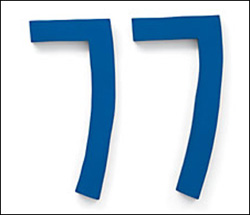
For decades, Tuttle has made art from shaped fabric and wire, often hung well above eye level. Weighty Minimalist sculpture might have taken flight, crashed into the wall, and deflated. At times, as in his 2006 retrospective, it seems in danger of blowing away. The artist sometimes rehangs things in the course of an exhibition, adding to their modesty, their transience, and their function as objects within an installation. His best-known works take their shape from letters and numbers, albeit with severe legibility problems. In that way, too, they ask one to see them as shapes—or maybe road signs—rather than canvases.
Maybe this time, it is the viewer's turn to be blown away. At some ten feet long, the works hardly look modest in intent. Each consists of two strips, each one foot high. The rectangular format obviously suggests painting. And stains cross them all, in small, parallel hatching or larger circles that can cover much of a strip. Together with the monochrome of each strip, they also add up to a lot of color.
In a sense, Tuttle was always painting. Again, the equation of fabric, shape, and color has something in common with Kelly, although without Kelly's illusion of intense light falling across the wall—or real light for Anne Katrine Senstad. Again, too, one often links Tuttle, born in 1941, also to shaped canvas by Stella or Murray. After 2000, brushwork becomes explicit. Here the fields add the austerity and soaked pigment of older abstraction. And yet the new work avoids painterly gesture in favor of dyed fabric and cold metal.
So forget painting? Hooks inserted in metal grommets, sewn into the fabric, hold it up. The threads, grommets, and strips have more to do with handmade tarps or sails. Sometimes the thread adds a zigzag of its own. Then again, color-field painting always demanded that painting show itself as an object. Robert Ryman, too, does everything he can to call attention to how he anchors painting to the wall.
Still, for all its echoes of formalism, the show is about color—expanses of it. The horizontal format hints at landscape, with the border between overlapping strips a horizon line. The jagged vertical marks can appear as canyons, trees, or vegetation. The yellow circles can seem like headlights on an open road. The scale, muted fabric colors, and sometimes acrid dyes go well with a highway at night. Tuttle's materials stick to the basics, but they have traveled a long way.

"The Art of Richard Tuttle" ran through February 5, 2006, at The Whitney Museum of American Art. "Walking on Air" ran at PaceWildenstein through April 25, 2009.


