Internationally Stylish
John Haberin New York City
Charles Gwathmey, Eero Saarinen, and Josiah McElheny
I had my first glimpse of Postmodernism almost before it existed, in 1972, when I applied to Princeton. Only months before, Charles Gwathmey had restored Whig Hall after a fire. In the process, glass walls and concrete cylinders replaced the 1895 imitation of a Greek temple.
They also leave an unfinished puzzle. Stairwells, corridors, and the façade itself lead to unexpected endings. Every element derives from Le Corbusier, but not their arbitrary placement. The intact Neoclassicism of Clio Hall next door only underscores the asymmetries. Gwathmey's 1992 addition to the Guggenheim pays a similar tribute to both Brutalism and Frank Lloyd Wright but refuses to resolve their conflicts. Each time, he leaves his origins behind, without ever quite settling on an elsewhere. 
If anything defines architecture today, it is lack of an elsewhere, much like individuals in a global world. Not everyone, however, outgrew Modernism and threw it away. Eero Saarinen designed curved buildings more than forty years before Gwathmey's last curved-glass tower. He also put America at the center of the International Style. In the galleries, Josiah McElheny looks back fondly on Mies van der Rohe, but with a little local color. It is worth preserving even now.
Modernity's terminus
At the very peak of the International Style, two of New York's most cherished buildings broke with the grid. Both, as it happens, opened after the architect's death.
Frank Lloyd Wright had been wrestling with the spiral ramp and dome of the Guggenheim Museum for fifteen years. Eero Saarinen had died of a brain tumor when the sweeping curves of the TWA terminal opened just three years later, in 1962. He had run his own firm for barely a decade, with Lebbeus Woods on staff, since his father's death in 1950. Wright and Saarinen alike came to stand for a time as images of modern art, motion, and space. Never mind about the grid: each also came to stand for New York.
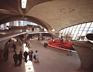
Which building made the most sensation? Saarinen's retrospective displays TV coverage back then from every station. Today interviewed Saarinen's wife, Aline, an early champion as art critic for The New York Times. The terminal's central mushroom at JFK still has iconic status, and a photo of its connecting tunnel still packs a thrill. Yet today tourists line up around the block for the Guggenheim, come good or bad exhibition, rain or shine. Saarinen's legacy stands empty, not integrated after all into JetBlue's new terminal, its future uncertain.
Not that anyone looks forward to airports these days, between endless delays and "security theater." However, Saarinen took his hits from the start. If Wright is almost a synonym for confrontational, Saarinen was all too accommodating. Along with the organic forms of TWA, Dulles, and Yale's hockey rink, he happily designed "Black Rock," the plain black slab for CBS, and blue glass for General Motors and IBM. His tulip chairs and tables sprang up everywhere, from stores to Star Trek, and his commissions had a way of getting built. And he did break with the grid, with curved forms that definitely do not follow function.
TWA notwithstanding, the Museum of the City of New York makes a curious choice for a retrospective. Born in Finland, Saarinen grew up in Michigan, where his father taught and where he lived to age thirty, with a break for studies at Yale and a year or two abroad. Then came wartime work for the federal government. In the optimistic decade that followed, he designed two embassies overseas as a display of American values. Perhaps his entire work was about modernity as a brand. He left his largest and deepest panes of blue glass for Big Blue.
Saarinen encompassed more of Modernism than his critics ever knew. They wanted to eliminate decoration, for the sake of form alone. He eliminated the very distinction between form and decoration, and he was not alone. His John Deere headquarters in Illinois has the warmth and solidity of Louis Kahn at Yale or the Ford Foundation by Kevin Roche and John Dinkeloo. Its exterior Cor-Ten beams also have their insistence on visible structure. The pedestal furniture eliminates the cluttering of interiors with chair legs, just like tube chairs by Marcel Breuer for Bauhaus.
Curved space
It also represents a collaboration with another influential American designer, Charles Eames. The Gateway Arch for Saint Louis has precedent in an unbuilt project of fascist Italy. Yet its style also meshed well with the triumph of American art. Its organic shapes became practically a cliché of postwar sculpture. The irregular punctuation of rounded windows at the University of Pennsylvania looks like a prototype of abstract painting. Make that postwar American painting.
Criticism dented his reputation, but so did time. It was a fight for the legacy of Modernism, and Saarinen suffered most of all because he won—or at least shared the prize. He and Philip Johnson both contributed to Lincoln Center, and I grew up thinking of the Vivian Beaumont Theater as what public architecture had to look like. Its cool white exterior led to the sedate but demanding rhythm inside. Compared to Broadway, it looked less stuffy, but with a single-mindedness that shouts high seriousness. Its concentric curves forced attention to the stage, just when performance Off-Broadway was about to run every which way and none.
All along, as the exhibition title insists, he was "Shaping the Future," but so were the 1950s. Saarinen's shapes hold the promise of the space age, most obviously with the sleek twist of Gateway Arch. The curve of Dulles Airport glides upward across a long central space. A college chapels starts with its polygon roof, as if entire building could float without support. Like the stone cylinder of another chapel, it refuses religious symbolism as well. It speaks to the shared values of nondenominational worship for a rational era.
It is also a gathering place. Saarinen brings people together. He shapes the curved edge of buildings at Yale into a common space. TWA's main hall creates a gathering point unseen in airlines today, between wings for departure gates and baggage claim. Its long tunnel presents a comforting enclosure, like his "womb" furniture. Even his plan for a private home, the Miller residence, has an inviting center in the sunken rectangle of a sofa and living-room table—all without the "miserable maze of legs."
But his work did have legs. If Saarinen fit with his time, he also won out by looking forward. His embrace of curves came to stand for pluralism, as with Frank Gehry. His poured concrete, Portland stone, and obsessive cantilevers lead through Brutalism to Zaha Hadid and Diller Scofidio + Renfro. His blue glass echoes in Bernard Tschumi's hulk of a Lower East Side condo. For younger artists on the Lower East Side, with iPhones rather than mainframes, that gives new meaning to Big Blue.
Architects like these work in every country and none. Gehry has only recently had his first New York building. Hadid, like Diller + Scofidio, had a New York museum shows with only a handful of built projects. Like Saarinen, she has also had more than one adopted home. The triumph of American art has given way to the triumph of a global art market. It will be thrilling to have the TWA terminal one day supply connections.
Kodachrome Modernism
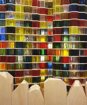
Josiah McElheny makes his own connections between the International Style and New York now. With Proposals for a Chromatic Modernism he recreates Mies van der Rohe's first proposal for a glass-clad skyscraper. Onto its 1922 towers, he grafts multicolored panels from a competing architect, Bruno Taut. On gallery shelves, he spins the same red, yellow, and blue into glassware—each shelf a study in one saturated, translucent color. In all this, McElheny imagines an alternative history of Modernism, much like Mark van Yetter. What if, instead of stripping away every trace of ornament, it found spiritual release in color? 
If McElheny echoes a familiar critique of modern architecture, he also sounds rather like Wassily Kandinsky on "the spiritual in art." He wants to see Mies as an emblem of pleasure, even before the warm glow of the Seagram Building on Park Avenue. Mies's connected towers, each set back at a different distance from the street, roll past like a wave. They also reach an improbable height. McElheny's colored plastic units look like stacked cups, as in sculpture by Tara Donovan. They and the shelving could share the same department in Bed Bath & Beyond.
The critique of Modernism's ideal cities as conformist could stand revision anyway. "Form follows function" has its roots not in esthetic purity, but in the nineteenth-century crafts movement. Conversely, Modernism's utopias often had a strong element of spiritualism and fantasy. Wright's retrospective this summer and the summer reopening of the Noguchi Museum have more than enough unfinished projects. It gets hard to disentangle humanism, arrogance, and just plain reaching for the sky. The High Line makes the whole debate more puzzling than ever—over preservation, displacement, gentrification, and renewal.
McElheny may never get over the past. Decorating a white cube goes only so far. It leaves architecture stranded, like the decorative Postmodernism of Michael Graves. Even in color, the shelves here look as barren as Minimalism. Bed Bath & Beyond has more choices. Conversely, stacked cups all but celebrate consumerism. Still, this is one nonexistent past worth remembering.
Enoc Perez has his own collision of architecture and color. He paints big buildings in an age of globalization. They have the grainy, washed-out look of digital manipulation. The artist applies the same style to a couple in an interior. He asks about the chances for pleasure, at the risk of withholding pleasure himself. Kodachrome film also breathed its last this summer, and perhaps only diehard Paul Simon fans cared.
Gwathmey died in August 2009, after finishing that curving glass tower in Astor place—and just in time for a real-estate meltdown. In its memorial, The Times concedes that some find the luxury condos "insufficiently deferential to their surroundings." However, they do not just break with the past, although they do, or defy function, although they do. Mostly, their tacky, misshapen bulk stands all too palpably for the invasion of wealth onto the Lower East Side. For others, as with Thom Mayne's dramatic Cooper-Union a few blocks south, Postmodernism can rethink not just history or function, but meaning in the present. Gwathmey never got that far, and others are still thinking it through.

Eero Saarinen ran at the Museum of the City of New York through January 31, 2010. Josiah McElheny ran at Andrea Rosen through October 17, 2009, Enoc Perez at Mitchell-Innes & Nash through October 10.


