Small Differences
John Haberin New York City
Marjorie Welish, Yun Hyong-keun, and Abstraction
Michael Rouillard and Erin O'Keefe
Painting today is resurgent. It is also often derivative and all over the map.
That can make me focus on big gestures, raging geometries, and hybrid media. Consider, though, two abstract artists who retain firm ties to Minimalism on the one hand and visual rewards on the other. Marjorie Welish still builds on small differences to create active compositions. Yun Hyong-keun, who came to maturity in the 1970s and died in 2007, stuck to sparer and darker stains on cotton. He cannot match her color and complexity, but he bridges late Modernism in New York and Korea. Last, Michael Rouillard, Erin O'Keefe, and others further attest to abstraction's problems and resurgence. 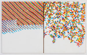
Same difference
Marjorie Welish knows as much as anyone the logic and illogic of abstraction. Her latest has her usual structural clarity. The result, though, is anything but predictable. As usual, too, the surprises begin with small differences. They can cause a painting to dissolve right before your eyes. Then again, it might just be getting going.
Not that she is saying what differences. Her show's title alone, "Some Differences," sounds designed to let painting speak for itself, although some may think of gender and women in postwar abstraction. Paintings starting in 2012 build on small squares of primary colors, with the brightness and opacity of acrylic, but they gain in intensity from orange and a paler blue as well. More recent paintings stick to shades of Payne gray, which can range from near black to sky blue. Artists often use it, in fact, as a mixer in place of black to gain subtlety and variety. Both series insist on the imperfection of hand-painted squares.
They are also diptychs. In another's hand, two panels can cohere as a balanced unity, like monochrome for Ellsworth Kelly. Here, too, though, Welish seeks out differences. Typically one panel sticks more closely to the grid, starting at the upper left. In the facing panel, squares begin almost at once to peel away. Both panels leave the very bottom empty apart from the pale ground.
She speaks of the two halves as differing not just in execution but in mode. How radical a difference? An exception, a painting from more than twenty years ago in four panels, offers clues. At the top left, the squares add up to diagonal bands of color, although with hints of white creeping in. Red, white, and blue start to take over in the lower left, while the colors burst into layered or colliding shards at the upper and lower right. In stripping things back to two panels, fewer colors, fewer explosions, and a more prominent ground, the new paintings seem designed to bring out the essentials.
 Welish overlaps a show in the same gallery of Owen Schuh. His title, "Drawing Rules," could apply to her as well, much as she called work in 2008 "Painting as Diagram." He, too, builds on small elements that, up close, take on aspects of mapping or drawing. From a distance, they often form concentric circles, like dabs of color for Alma Thomas. Welish's diptychs and her alternation between color and gray may also recall the mitered mazes of Frank Stella. Again, though, her patterns refuse the predictable or complete.
I thought, too, of the sputtering pixels from primitive video games, especially given the sense of motion. She may find the association distasteful, but she is still insisting on the limits of the digital in the hands of a painter. She must also remember when theorists were starting to quarrel with formalism—and not just for the sake of politics or gender. Deconstruction saw language and literature as rule-based structures that cannot help breaking the rules, no more than an artist like Hassan Sharif with his numbered squares. Exhibitions were speaking of "line as language" as well. In each case, differences large and small cannot help adding up to sense.
Gates of perception
If one is going to take Mark Rothko halfway around the world, it only makes sense to rotate the painting as well. Rather than stacked pillows, Yun Hyong-keun favors rising or falling pillars, most often side by side. They may nestle against the picture's outer edges, their rounded peaks not quite touching the top. They may start nearer the center, almost covering the whole. Either way, they draw one up close to watch the dark oil spread. One can immerse oneself in the slivers or fields of bare cotton, stained by osmosis or the artist's touch. 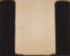
The Korean artist found a welcome in New York in 1974. Donald Judd invited him to west Texas. In turn, his paintings from 1976 through the 1980s have an obvious debt to late Rothko, and he worked on the floor like Jackson Pollock. I cannot swear that he met Morris Louis, but he, too, thinned his paint to watch it run. The stains at the edges of his widening bands approach raw turpentine. One might borrow from Louis oneself and retitle the paintings Unfurled.
Still, they belong to another continent. Yun died in his late seventies, little known here. Like Mono-ha in Japan, he adapted Minimalism to Asia. He compared his blackness to ink and its flow to calligraphy from the nineteenth century. If he has rotated Rothko ninety degrees, some older Korean writing may read vertically. One can think of the irregular stains as bad penmanship. One can think, too, of the pillars as gates of perception.
They work best that way, rather than as color-field painting. As with Rothko or Ad Reinhardt, blackness is not what it appears. The work comes in two series, Umber-Blue and Burnt Umber & Ultramarine, for its true two colors. Still, one can look a long time without seeing either one. One can look in vain, too, for a signature element like Rothko's rectangles or Reinhardt's squares, apart from those widening edges and their turpentine stains. One can look a long time all the same.
Not every stained canvas out there is a doorway to perception. Maybe you think of a few stalwarts and standouts as sustaining painting through its lean years, like Jennifer Bartlett or Elizabeth Murray. Maybe you think of a resurgence today driven by artists and midlevel dealers facing a system stacked against them. Still, stained canvas today has a pricy and public side as well. Glibber versions than Yun's are turning up in the mainstream. Where others speak of zombie formalism, they approach subjectivity for the living dead.
At least they share a love of color. Katharina Grosse applies it to canvas and aluminum with a spray gun, where scale and electric hues supply an energy that the arbitrary shapes and drips may not. Adrian Gheni brushes it onto canvas, where what may look at first like abstraction represents the lap of luxury, on balconies overlooking the mountains. I prefer Liliane Tomasko in the more modest surroundings of the Lower East Side, where bright primaries out of Joan Mitchell give a balance of luxuriance and control. With Grosse from Germany, Cheni from Romania, and Tomasko from Germany via Switzerland, has the rebirth of painting become just another tool of global markets? Maybe, but one can always return to umber, blue, and black.
Hard to choose
The revival of painting has a serious down side: it becomes hard to choose. When anything goes, who is to say what matters? How can any artist leave a signature, when the very idea of authenticity has taken a decades long beating? Still, the sheer lack of firm directions allows abstraction to cross boundaries in genres and media—and critics like me to make guilty choices. Call everything out there derivative art if you like, but then it has plenty to draw on, or call it "zombie formalism," but then the dead can walk again.
Two years back, Jackie Saccoccio and Stephen Maine offered a study in contrasts in all-over painting. And Saccoccio still invites comparison to Pollock, but her canvas has come more and more off the floor. It also combines oil and mica, with small strokes that approach circuit diagrams in their fixity, brushed onto larger splashes of color. She also turns to paper on much the same scale, in what is hard not to call painting. Gouache and ink spill into one another, for a continued play of fluidity and line. Both series make ample use of the ground, whether the weave of canvas or the white of paper.
Maine still pursues a kind of relief printmaking, with plates the size of canvas and with all sorts of materials in place of wood. They leave quite an impression, with cracks and ripples in their acrylic layers. They also push more determinedly than ever to the edge of the canvas. Speaking of a printer's blocks, does Sean Scully in his seventies still make oil look like brickwork? Now his work admits as much, with "Wall of Light Cubed." Some paintings depart from two dimensions through illusion, adding angled planes to the edge of his gridded rectangles,  while sculpture takes the stacked colors into the center of a room.
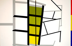
Like Saccoccio, Michael Rouillard works between line and color—and, like Scully, between Minimalism and illusion. His paintings depart from white only with slim verticals and horizontals that cross at regular intervals, sometimes with thinner and darker lines at their center becoming darker still where they meet. Together, they transform the gallery walls into layers of white. He has also been drawing on paper torn from spiral notebooks until they fill the sheet with a near uniform blackness, much as Callum Innes uses small gestures to create simple monochrome. The torn edges serve as drawing, while the drawing serves as painting and the long row of sheets as installation. After twenty-four years and one hundred sheets, he may finally be calling it a wrap.
Erin O'Keefe looks back to an earlier Modernism. Overlapping planes have the jagged or curved edges of the transition to abstraction in Fernand Léger and Francis Picabia. They do not, though, look at all like bodies in motion. Rather, they sit still for good reason: a lighter touch and greater gradation of tone allows the planes to concentrate light. The effect is all the more striking in two paintings that stick to black and white.
Other work departs further from Cubism to focus that much more on the glow. The easel scale and near uniform dimensions of her work brings out the shared interest in color and light. In one, a bubble appears tucked into the corner of a room. In another, a strip folded twice seems to float in space. It looks almost like a computer graphic. O'Keefe's compositions and colors can seem arbitrary, but they underscore how abstraction is still learning from both modern art and the present.

Marjorie Welish ran at Art 3 through February 5, 2017, Owen Schuh through December 18, 2016. Yun Hyong-keun ran at David Zwirner through February 18, 2017, Katharina Grosse at Gagosian through March 11, Adrian Gheni at Pace through February 18, Liliane Tomasko at Marc Straus through February 10, Jackie Saccoccio at 11R through April 30, Stephen Maine at Hionas through April 30, Sean Scully at Cheim & Read through May 20, Michael Rouillard at Pablo's Birthday through April 23, Callum Innes at Sean Kelly through April 29, and Erin O'Keefe at Denny through May 14.
