Red in the Face
John Haberin New York City
Seeing Red
Gallery-Going: Painting in Spring 2003
Maybe I had to see the sky again after crawling through one too many subterranean installation. Maybe I had to come back to earth after the grandeur of sculpture, like Rachel Whiteread's stairs cast up to the rafters. I had started my spring gallery tour, and seen all that.
No paintings this spring could move me nearly as much. Then again, perhaps they had no need to try. It may sound odd. Think of the claims made for painting again and again, back when it mattered. Think of the demand to make it new. Yet instead, I keep recalling some shows for their modesty and, strange as it may sound, their skill. 
At Hunter College, "Seeing Red" still hopes to reduce painting to a science. It made me appreciate more a handful of painters for whom art remains a very personal craft. That includes abstract artists such as James Nares, Gregg Stone, Walter Biggs, Callum Innes, and Pat Lipsky, as well as imaginary landscapes by Nancy Scheinman. A look ahead to her work again in 2007 helps pinpoint the landscape of her imagination.
Bright ideas
Call it a bright idea, so bright that the work positively glares at the viewer. Hunter devotes both its galleries to the color red.
Uptown, in a space so small that one can easily turn one's back on it, a dozen works trace "Pioneers of Nonobjective Painting." Largely American, they take one from Hans Hofmann and Robert Motherwell to Richard Anuszkiewicz and Jack Youngerman. The last two also turn up on a desolate street southwest of Times Square. There Hunter maintains its MFA program—along with a maze of rooms big enough to accommodate one hundred and sixty works. They date from the last ten years alone.
The concept has a deceptive simplicity. So do most concepts when it comes to art. The Times reported it as an innocuous constraint on the mess of abstract art. Forget yellow and blue, went the headlines. Stick to a color with the intensity of anger and blood. Forget shock art. Even without sensational images, art can get red in the face.
Then again, so much for simplicity. The curators allow artists to use any number of colors—so long as the work remains about red. That about matters. This show treats color as an idea, and painting as the science of presenting it to the human mind. It starts with a display of actual color charts, but their early history rather than the palette that pops up on-screen with Photoshop. It shows how scientists, printers, and artists first reduced color to its axes of light. It makes the case that modern art—meaning abstraction, naturally—evolved in tandem with the technology of color reproduction, not to mention optics and a scientific psychology.
Besides what slips in, consider, too, what gets left out. A concept of color does not have room for the concept of painting. One will not see late modernist concerns for expression, truth in representation, illusions of space, or the materiality of a painting's support. One will definitely not see a life after Modernism. The exhibition has no room for randomness, conceptual art, or the shadowy presence of photography.
The hallway uptown never looks back to Suprematism, Russian Constructivism, or other early modern gambles. It skips over Ad Reinhardt before Reinhardt's black paintings—or Mark Rothko, with those glorious reds that reinvent of the picture plane as illusion. It skips Robert Rauschenberg and his messy red fabrics, like testimony to an act of violence. Of the sixty or so younger artists in midtown, most from Europe, about half work in Germany. Ironically, such quaint concerns as touch slip in with the occasional American, notably Marcia Hafif.
Seeing what
Hunter allows nothing to spoil the "nonobjective" esthetic—a bit like what the Guggenheim once called "freedom and discipline" but without the freedom. Red means every medium from oil and acrylic to raw pigment and torn, clotted paper. Yet it crawls firmly to the edge of every two-dimensional surface. Wall labels stray far from the work, so as not to impinge on their optical purity. The labels give an artist's nationality as a single letter, as if politics and other human quirks belonged to a branch of higher mathematics. Works by even a single artist scatter to distant parts of the midtown maze.
The agenda—"all over," nonrepresentational, and downright disembodied—may sound a lot like the color theory of Josef Albers. Sure enough, he has a prominent space uptown. In fact, decades before him, the show's co-sponsor anticipated the Bauhaus vision of uniting art and design. The Karl Ernst Osthaus-Museum Hagen, born in Westphalia around the turn of the last century, also supplies almost all of the midtown display. It gives an American like me a stern introduction to European artists and their global heritage. However, it subordinates their individual conceptions to a larger concept still, the exhibition.
In the end, I relished most watching the theme unravel. Like a proper modernist myself, I started by looking for subtle variations in texture. I took away, however, the tension between the purely visual theme and the physical impact of red. Colors range from darker, almost blue-black tones to thick surfaces as gleaming as a blood-stained mirror. They have one asking not how one sees, but rather what one sees when one is seeing red.
Hunter tries to eradicate boundaries between painting, psychology, and physics. Yet the more that red becomes a sign, the more it recovers all its verbal, all-too-human associations. The more that science dematerializes the concept of color, in the software of mind and art, the more it recovers a context for color in the hardware of mass reproduction. Photoshop triumphs after all, along with the glowing red fire of artists—both in the show and left out.
I can imagine a prototypical American take on color. It might stick instead to black and white. Uptown with the old fogies, it might have Jackson Pollock for his black swirls, Rauschenberg for his erasures of de Kooning, Jasper Johns for his white flags and intimations of mortality, Frank Stella for his black stripes, Robert Ryman for his white oil against canvas and metal bolts, and even Judy Chicago for her white china. Downtown, with more choices than I can count, it would have room for younger formalists, abstraction that even disdains painting, and the dark theater of video and new media today.
Then again, it might look colorful after all, maybe even red. It might even look like some New York galleries this spring.
Coolness and control
Ross Bleckner abstractions make a surprisingly placid comeback. His DayGlo canvases hover somewhere between luminism and appropriation, like geometry caught in the act of cross-dressing. Bleckner mixes fluorescent color with enough white to give my apartment the paint job that it sorely needs. His cool emotions and thick atmosphere owe roughly equal parts to landscape, inner space, and discos. I hoped that he would disappear along with the 1980s, but then "Lady Marmalade" returned to the charts last year, too.
More my style, James Nares includes at least one red painting in his latest show. Mostly vertical in format, they once again give the illusion of a single gigantic brushstroke. One can enjoy the texture of the paint and shadows. Even up close, however, one can never dispel the illusion of a brush spiraling down the canvas.
Nares uses paint to represent itself, and it shows the influence of mechanical media. Still, he represents brushwork as artifact rather than as image. When Roy Lichtenstein paints paint, he alludes to printing techniques, with his usual sense of humor. When David Reed blows up paint, like evidence in an unsolved murder, his baroque gestures and colors evoke film strips. Nares depends on photography more in the way that Chuck Close does, challenging his own painterly authority and insistent virtuosity.
Gregg Stone earns his strokes the hard way, too. He pours, abrades, and compresses tar, then spray varnishes it a few times to boot. Somehow, he ends up with a paper-thin surface, the brown of his tar indiscernible in facture from the white of the paper. They emerge as one nearly symmetric pattern, like a snowflake or pressed leaves. Frankly, Stone's images leaves me cold, but their density suits his obsessive control. He turns tar into shades from light red to near black, from hard edges to chiaroscuro.
Walter Biggs, in contrast, builds up his monochromes like the icing on a cake—perhaps a cake by Wayne Thiebaud in Thiebaud drawings. The rippled surface and round format function at once as painterly gesture, image, and object. His materials seem like fragments from a sphere with a deep past—perhaps the earth, the ocean, or a meteorite.
John Yau, a poet and critic, calls them chthonic. For those without his breadth of art and language, that means infernal. I think of Biggs, though, as too intimately connected with surface and object ever to dwell within the earth or myth. To the contrary, his paintings risk too loose a conception, too tarnished a color, and too banal a form. Yet their reserve gives them a quiet spot between object and image.
Shaking heads
I could just as well throw in artists who never just see red. Callum Innes paints large rectangles in Scheveningen black, then all but washes out the black with turpentine until one sees shades of green and blue. They look almost too tidy for all the effort, as if he neglected to wash them out entirely. I cannot deny, however, the elegance and the play between transparency and weight.
Pat Lipsky fills canvases tightly with thick vertical bars. Her emphatic grids refuse their own apparent symmetry, and her restrained surfaces hide strong color. The brighter underpaint shows through where the bars met—like colorful grouting for re-tiling the gallery. Yes, sure, I hear you complaining: Brice Marden and others did all of this long ago. But Lipsky lightens the palette and the dogmatism, while shifting the focus to the layer one almost misses and now never will. Geometry becomes depth and, as Lipsky herself says, color and rhythm.
Needless to say, any of these artists could enter a show of the basis of color, vision, and abstraction. Needless to say, too, they would all have Albers shaking his head in dismay. At least I hope they would.
All of them break up a colored surface in unpredictable ways. They revel in illusion, and they allude to every medium but their own. They draw the eye past color and surface, to the work and its creation.
The combination sounds quirky, not to mention overly concerned with its own virtuosity. That may explain why it never quite loses an academic flavor. None of these haunt or disturb me like my favorite art, including the best of abstract painting. I turned to them as much for technique as for games with my mind and heart. I lingered for what grander projects may nonetheless leave out—the variety of projects still possible and surely still to come.
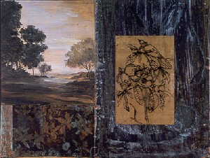
One modest display of virtuosity did move me on repeated visits, only hardly as abstractions. Nancy Scheinman brings to landscapes the multiple layers of her materials and her imagination. She calls the series "In Earth There Is Heart." Earth functions at once as pigment, image, and solid ground that even a visionary can never quite leave behind.
Earth to painting
Not that Scheinman shies away from the modernist grid. Especially in her largest work, small, square framing images set a geometry for the whole. Nor does she lose an abstract artist's play between matter, image, and symbol. Drawings on plastic or wire mesh have a fluid economy suggesting the influence of Asian art. Overlays of copper hold raised patterns, like hieroglyphics from a yet undiscovered culture. Materials and conventions multiply fast.
Her central images have the atmosphere of a late Romantic American landscape. Their golden-yellow skies only intensify the darkness. More presences hover over this land, including translucent echoes of Dutch still life and Italianate women. At one point I spotted a Fifer, after Edouard Manet. Ralph Blakelock looks through the eyes of Robert Rauschenberg, and he falls in love with what he sees.
When I first approached Scheinman's work, I feared an art-history quiz, complete with, literally, her own transparencies. Returning, I feared a message too precious and personal for words. The twin impulses amount to two intimately linked forms of nostalgia. In practice, chance and convention, like materials and the grid, also keep one another from descending into sentimentality. Neither the artist's longings nor the promises of art claim an ultimate point of origin. If I could hold that flower in my hand, which of its representations would I touch?
As a postscript, when I saw her work again in 2007, I could again admire how dense pigments, allusions to art history, and an underlying grid qualify a longing for the visionary. Yet this time the layers of pigment grow denser and the grid still more prominent. For one thing, the landscapes extend across surrounding square, textured metal plates. These function as elements of drawing, as decoration, as the grid, and also as a frame. The division becomes more obvious in the central area as well, but she has no qualms about letting individual scenes within a larger picture overflow it.
The scenes owe something to the Pre-Raphaelites, with the fall of light across soft, delicate human bodies. If that does not scare you enough, they show off more conventional skills as well. Trees reflect the fine branches and muddy leaves of a Venetian Renaissance landscape. She also throws in yet another mode of representation, thanks to a collaboration with Robert Creamer. His own work, actual scans of flowers into digital color, looks like Martin Johnson Heade on LSD. I have mixed feelings about them, but the collaborations thus discover additional layering and additional juxtaposition of scales, so that one can choose to resolve it only by drawing closer or stepping back.
In both shows, the layered materials and images suggest the myth of a purer past. So do the fluttering dresses and glowing landscapes. The myth itself connects the paintings themes—rural America, femininity, the world of dreams. Given America these days, no wonder the landscapes seem so distant and so dark, as for Sally Mann. The paintings give one the tool to question the myths, along with the technique to fix them in reality. The grid locks the scene in place, and the light looks true.

"Seeing Red" ran through May 3, 2003, at Hunter College Art Galleries. Ross Bleckner ran through April 19 at Lehmann Maupin, James Nares through April 26 at Paul Kasmin, Gregg Stone through at Pierogi, Walter Biggs through at Sperone Westwater, Callum Innes through March 29 at Sean Kelly, Pat Lipsky through April 12 at Elizabeth Harris, and Nancy Scheinman through May 3 at Allen Sheppard. Her 2007 show there closed April 28.


