Recycling Abstraction
John Haberin New York City
Gallery-Going 2012: Lia Halloran and Jeffrey Kessel
Sharon Butler, Mark Bradford, and El Anatsui
Call me old-fashioned. Just don't call me derivative.
That put-down dogged abstraction for a long time, back when painting was, you know, dead. Since then abstraction has roared back, but by quoting—often to the point of conceptual art. So surprise, for another year brings no end of sincerity, with pleasures of its own. If that makes it hard for anyone to change the game, not to worry, for nostalgia can become quotation again when you least expect it. 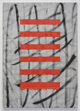 Let me offer a guided tour of the alternatives. If I move quickly this once, abstraction is all about a changing landscape.
Other histories are bubbling up, too, like the drawings of Josef Albers, the shaped canvases of Charles Hinman, and the very idea of painting's "forever now." (I give them their own reviews, separately.) Younger artists are modestly looking back, like Lia Halloran, but so are dedicated artists reflecting on themselves and their work, like Jeffrey Kessel. They can question the whole idea of distinguishing breaking boundaries from pure painting. Sharon Butler gives formalism a precise but casual air, while Mark Bradford, El Anatsui, and others use literal scraps of painting and the street. They and others are recycling rather than just reusing the past.
Second derivative
So what are the alternatives, in what shows have called "Post-Analog Painting," another "Searching the Sky for Rain," and "Chromatic Figuration"? Geometry, of course, as Sadie Benning, Gary Petersen, Kellyann Burns, Trudy Benson, and others display the languages of art. Warren Isensee never once abandons right angles, in compositions based on slim, nested rectangles. Color alone breaks the symmetry, with a vengeance. It has the brash frontality of an early Frank Stella, but one need never fear getting lost in these mazes. Want some geometric alternatives? Orchard Street rolls out its share as "Line and Plane," a rubric as familiar as formalism itself, not to mention from such revivals as "The Shapes of Space" in 2007. If tilted fields for Don Voisine or Gary Petersen, Halsey Hathaway's biomorphic ones, or Rob de Oude and his denser grids mean only that the Bushwick mafia has come to Manhattan, so be it, and Paul Pagk's traces against monochrome stand out as well—if a trifle derivative of Robert Mangold.
Remember gesture and excess, building up and wearing down? Second-generation Abstraction Expressionism was long the ultimate putdown, and it has hurt especially Michael West and Albert Kotin as well as Sonia Gechtoff, but Carolanna Parlato does a pretty good job for the nth (or maybe n + 1) generation. One painting bears the circular marks of a paint can out of Jasper Johns and Johns prints, but Parlato's heart lies in broad, fluid fields of color, overlaid both wet and dry. She has gained in two years, too, from the hints of rectangles and of Mark Rothko. For a close alternative, Monique van Genderen or Ayn Choi leans to larger canvases, with more white space and the vertical marks of color fields under the influence of gravity, time, and fluid mechanics. For these artists, as for Stephen Maine, bright color descends like a shade drawn over the unseen.
Brushstrokes can separate from the field to become subject matter, too. They do implicitly for any formalist—and explicitly for David Reed, Francisco Ugarte, Virginia Jaramillo, or Mark Sheinkman, who can make them move across canvas in real time, like a film close-up. And so they do for Stephen Ellis, whose work I first saw in the dark days of abstraction nearly twenty years ago at Snug Harbor. He still has the celluloid translucency of black against white or, in one instance, a lush red over itself. He also uses narrower horizontals, like actual film strips, but interrupted or overlaid by other, stricter geometries, as if to provide the digital version. For, yes, an alternative, Drew Shiflett weaves together rows of vertical traces on softly textured strips of handmade paper and cheesecloth.
The next logical step is to embrace quotation after all, by letting a painting serve as a mark of itself. Alex Olson does, with pairings to underscore the doubling. As "Palmist and Editor," she sets two columns of stippled primaries side by side but apart, for Joan Mitchell, and adds colors to a "zip," or vertical stripe, for a dismembered Barnett Newman. Bold red stripes land across an inky weave, like Barbara Kruger, Abstract Expressionism, and Asian art in a three-car pile-up. For an alternative, Lee Vanderpool applies his descending impasto in rows of increasing height—referencing at once perspective, a color chart or color wheel, and the brush itself. Other works leave traces of white on white, for a schematic Minimalism, and black across horizontals rising into blue, like a conceptual diagram for a Surrealist landscape.
Ironically, the death of painting just happened to coincide with Postmodernism's embrace of the derivative. From the "Pictures generation" to the Young British Artists, artists were quoting artists quoting Warhol. It seems only fair, then, that abstraction has had a resurgence—but with no end of riffs on imagery, photography, stains, poured paint, trompe l'oeil, and signs and symbols. Impurity has replaced the avant-garde as a way of breaking boundaries in art. And that seems a good thing, when so many open studios and collectives still look derivative in the worst way. Still, if the fall openings here pay a price for refusing that narrative, in a certain tame familiarity, they also lay out the alternatives and fill in a history.
Maybe one has to step back a few decades after all to escape the derivative, as with a lovely and firm look back at Ralph Humphrey and shaped canvas. For one last alternative, two noted galleries collaborate on a rediscovery of Ernst Wilhelm May, who died in 1968. A dark series has black "eyes" out of Asger Jorn or Albert Oehlen, while brighter paintings adopt curves and rhythms for their own sake. A few biomorphic abstractions come close to combining the two, with shades of ochre. They are marvels, and somehow the brightness and hard edges of the latter series approach Pop Art after all. If the "postmodern paradox" means anything, in the perpetual reinvention of Modernism, quotation is not going away any time soon after all.
Signs of life
Lia Halloran has the blues. They course through her white sheets with the width of brushwork, the fluid motion of a pen, and a life of their own, which makes sense once you recognize them as blue ink on drafting film. One does not always remember ink as color rather than drawing, but polyester allows the pigment to deepen as it sets and to fade as it runs. Her designs still look like Chinese calligraphy, too, except for one minor detail: there is no getting around the human beings at the edge of abstraction. These being friends of the artist on the Lower East Side, they could be dancing or skateboarding, and one sees mostly the back of their heads.
Sandeep Mukherjee, too, works on film with a watery ink. Not surprisingly, he, too, shows signs of life—but a less ordinarily visible life. Where Halloran's matte surface looks very much like plain paper, his Duralene polymer is more like Mylar or celluloid, and acrylic ink stays put between his hard edges. Banded curves and tendrils cross one another, for a slightly cluttered geometric abstraction. He mentions mandalas, kaleidoscopes, and fractals. I thought more of slides in a biology lab.
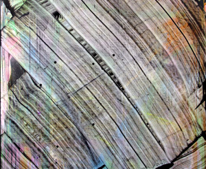 Once life enters that space between abstraction and realism, even microscopic life, it is hard to ignore the artist. Someone must be behind the translucency, design, and change. Jeffrey Kessel works with all of these, too, in layers that keep unfolding the more one looks. His creative process is everywhere in the work as well. And that only complicates the relationship between the work and the artist. Biomorphic abstraction can mean lumpy fields of color, like cartoon illustrations left over from someone's Biology for Dummies, but this artist is not for dummies.
Kessel comes as close to "pure painting" as one can get nowadays. He works with oil on canvas, with not a hint of representation, and then he works some more. He scrapes or erases the paint, and then he paints again—and do not expect the consummate ease of Gerhard Richter and Richter's late work with a squeegee. Often the shape of the color fields is unknowable. At other times troweling through paint or scraping it away leaves its own bands. If the painting made itself, and in a way it did, the artist must have exhausted himself in the process.
Sometimes that topmost layer is gray, as if to bury its traces. A final spurt of lines or curves could supply the mark of the artist, or it could signal a work still in progress. The ongoing process continues with the viewer as well, as more colors emerge over time. Compared to Halloran's casual freedom or Mukherjee's fuss and muss, Kessel's abstraction may seem more like an older Modernism, and I was grateful for it. One does not even have to decide between form and expression. Yet his most personal mark is effacement or erasure, as much as Postmodernism could ever desire, very much including effacement or erasure of the artist.
Each of these exhibitions plays with motion, chance, and change—all with a clear assist from the artist. If anything, Halloran makes it look too easy, for her subjects and herself alike. She calls the series "Metamorphose," but do not wait for either one to turn into a cockroach and get pelted to death by downtown neighbors. All three exhibitions also revive an old debate over the artist's gesture. Back when people talked about "pure form" or "action painting," were the interpretations at odds or complementary? Nothing in art is pure these days, including the action, so maybe it makes sense to look not for answers, but for metamorphoses.
Casual chic
Is a casual flair going around? Sharon Butler even calls her show "Precisionist Casual," a term that might apply to Judy Rifka as well. Butler works with canvas as well as the stretcher, but she refuses to stretch it, and her precisionist geometry remains studiously imprecise and incomplete. James Hyde is back with scraps of his own, not all of them glue, pigment, and acrylic. Some amount to small conflicts within a painted rectangle. Others stand within tall glass boxes, as if tossed aside for later use, and neither set of works looks designed.
Much of painting now or indeed sculpture now is very much about breaking boundaries. That can mean the boundaries between media or between abstraction and representation. It makes sense now that painting is back but photography, new media, and appropriation are not going away. It makes sense, too, in an art scene restless at the edges and growing in all directions. And that may not be altogether a good thing. When anything goes, things can easily go nowhere. 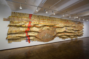
Still, the restlessness invites experiment. Mark Bradford works with paint on found posters. In "Street Level," for the opening of ICA Boston, he might have been getting a free pass by claiming both street culture and abstraction. More recently, he left some of the best painting of the year. Layered, torn, and thick with mostly white paint, his work was getting not just bigger, but harder to dismiss. Something was going on, and one had to keep coming back to find out just what.
Much the same has happened with El Anatsui, an example of contemporary African art caught up a few years back in arguments about the state of the art world. Per some savvy criticism by Roberta Smith, installations and other showy work were crowding out painting. His latest makes for a satisfying answer. He gives his hammered metal a wilder variety of shapes and colors. More than once, what one knows as the caps to liquor bottles softens into tapestry before one's eyes or unravels onto the floor. Besides, one gets to see what brands are on sale in Africa, and they are not luxury items.
Do these artists point to room after all for just plain painting? Shaun O'Dell uses paint and paper strips to contrast randomness and impulse—daring one to see which is more predictable. Julian Lethbridge has his lushest show yet. Lethbridge emulates the geometry and gesture in postwar abstraction, but without the slashing shapes or the drips. That may risk blandness, but the horizontal edges of his oil impasto ripple across canvas like a storm surge. I also gained a new appreciation for Joseph Stashkevetch, whose sanding of his own meticulous landscapes in Conté crayon gives rag paper the texture of abstraction, the blur of atmospheric perspective, the spark of sunlight in a clearing, or the reflection off mountains in the snow.
The distinction between breaking boundaries and tradition is not altogether one of quality, although show after show can look awfully tame. It is not simply about generations either. Wood scraps from Cordy Ryman do and do not function like the nuts and bolts holding painting to the wall for Robert Ryman—and they are and are not painting. Hyde shares a room with almost indistinguishable patterns from Jessica Labatte's photography. It is not even about form versus expression, and it is the postmodern paradox: recycling old forms and old materials need not pine for old ecosystems.

Warren Isensee ran at Danese through October 6, 2012, "Line and Plane" at McKenzie through October 28, Carolanna Parlato at Elizabeth Harris through October 6, Monique van Genderen at D'Amelio through October 20, Stephen Ellis at von Lintel through October 13, Drew Shiflett at Lesley Heller through October 14, Alex Olson at Lisa Cooley through October 28, Lee Vanderpool at The Proposition though October 5, Ralph Humphrey at Gary Snyder through October 20, Ernst Wilhelm May at Mary Boone through October 6 and Michael Werner through October 27, Sandeep Mukherjee at Brennan & Griffin through November 25, Jeffrey Kessel at Thierry Goldberg through December 23, and Mark Bradford ran at Sikkema Jenkins through December 22.
Lia Halloran ran at DCKT through January 6, 2013, Sharon Butler at Pocket Utopia through February 17, James Hyde and Jessica Labatte at Horton through February 3, El Anatsui at Jack Shainman through January 19, Shaun O'Dell at Susan Inglett through February 9, Julian Lethbridge at Paula Cooper through February 16, and Joseph Stashkevetch at Von Lintel through February 23.
Related articles take up Mark Bradford, El Anatsui, Julian Lethbridge, and Joseph Stashkevetch. Rather than write about these four again, when I had too little to add, I have tinkered there, hoping to incorporate what I have learned.
